Performance

Introduction
There is an unquestionable, detrimental effect that slow speed has on overall user experience, and consequently, conversions. But poor performance doesn’t just cause frustration or negatively affects business goals—it creates real-life barriers to entry. This year’s global pandemic made those existing barriers even more apparent. With the shift to remote learning, work and socializing, suddenly our entire lives were moved online. Poor connectivity and lack of access to capable devices made this change painful at best, if not impossible, to many. It has been a real test, highlighting connectivity, device and speed inequalities worldwide.
Performance tooling continues to evolve to portray those diverse aspects of user experience and make it easier to find underlying issues. Since last year’s Performance chapter, there have been numerous significant developments in the space that have already transformed how we approach speed monitoring.
With a significant release of the popular quality auditing tool, Lighthouse 6, the algorithm behind the famous Performance Score has changed significantly, and so did the scores. Core Web Vitals, a set of new metrics portraying different aspects of user experience, has been released. It will be one of the factors for search ranking in the future, shifting the eyes of the development community onto the new speed signals.
In this chapter, we will be looking at real-world performance data provided by the Chrome User Experience Report (CrUX) through the lens of those new developments as well as analyzing a handful of other relevant metrics. It is important to note that due to the limitations of iOS, CrUX mobile results don’t include devices running Apple’s mobile operating system. This fact will undeniably affect our analysis, especially when examining metric performance on a per-country basis.
Let’s dive in.
Lighthouse Performance Score
In May 2020, Lighthouse 6 was released. The new major version of the popular performance auditing suite introduced notable changes to its Performance Score algorithm. The Performance Score is a high-level portrayal of site speed. In Lighthouse 6, the score is measured with six—not five—metrics: First Meaningful Paint and First CPU Idle were removed and replaced with Largest Contentful Paint (LCP), Total Blocking Time (TBT, the lab equivalent of First Input Delay) and Cumulative Layout Shift (CLS).
The new scoring algorithm is prioritizing the new generation of performance metrics: Core Web Vitals and deprioritizing First Contentful Paint (FCP), Time to Interactive (TTI) and Speed Index, as their score weight decreases. The algorithm also now distinctly emphasizes three aspects of user experience: interactivity (Total Blocking Time and Time to Interactive), visual stability (Cumulative Layout Shift) and perceived loading (First Contentful Paint, Speed Index, Largest Contentful Paint).
Additionally, the score is now calculated using different reference points for desktop and mobile. What this means in practice is that it will be less forgiving on desktop (expecting fast websites) and more relaxed on mobile (since benchmark performance on mobile is less quick than desktop). You can compare your Lighthouse 5 and 6 score difference in the Lighthouse Score calculator. So, how did the scores really change?
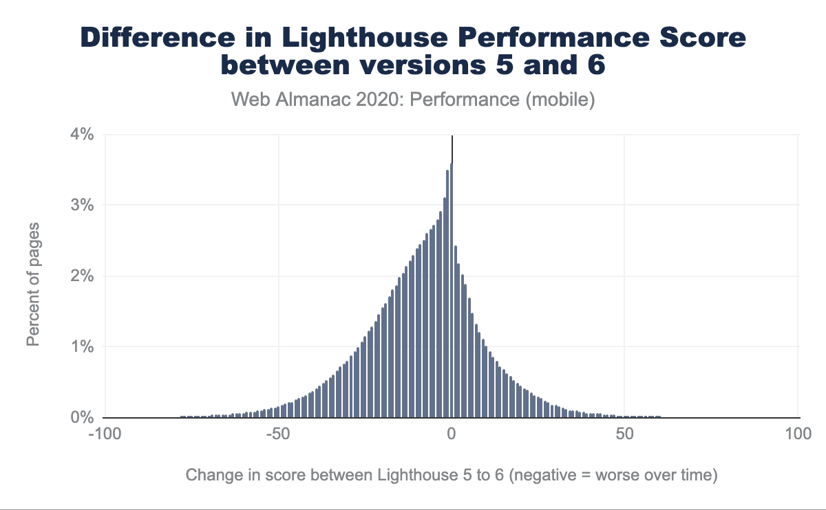
Above, we observe that 4% of websites recorded no Performance Score change, but the number of sites with negative changes outweighs the ones with score improvements. The Performance Score grades have gotten worse (with the most prominent decrease curve in the 10-25 points area), which is portrayed even more directly below:
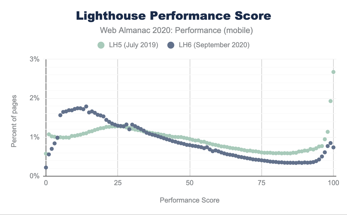
In the comparison of Lighthouse 5 and Lighthouse 6, we can directly observe how the distribution of score has changed. With the Lighthouse 6 algorithm, we observe a rise in the percentage of pages receiving scores between 0 to 25 and a decline between 50 and a 100. While in Lighthouse 5, we saw 3% of pages receiving 100 scores, on Lighthouse 6, that number fell to only 1%.
These overall changes are not unexpected considering a multitude of amendments to the algorithm itself.
Core Web Vitals: Largest Contentful Paint
Largest Contentful Paint (LCP) is a landmark timing-based metric that reports the time at which the largest above-the-fold element was rendered.
LCP by device
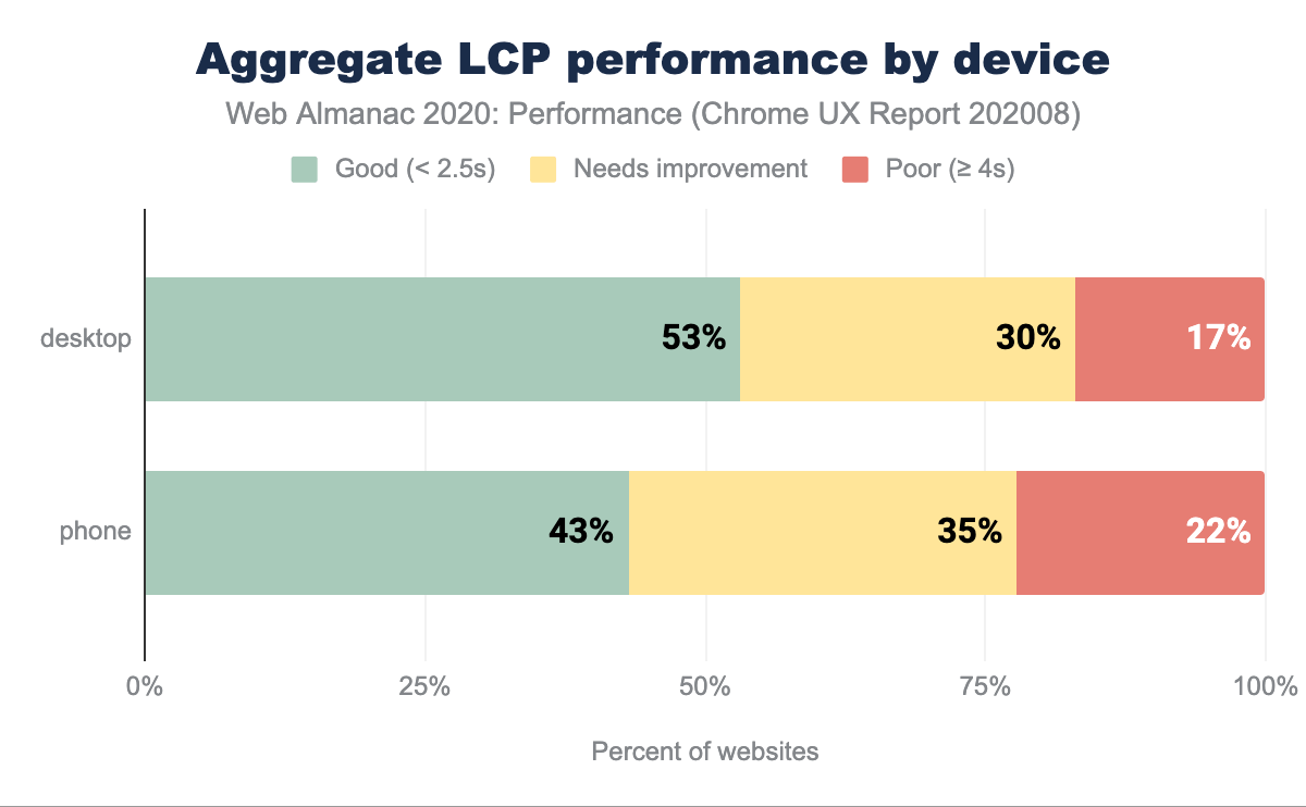
In the chart above, we can observe that between 43% and 53% of websites have good LCP performance (below 2.5s): the majority of websites manage to prioritize and load their critical, above-the-fold media fast. For a relatively new metric, this is an optimistic signal. The slight variance between desktop and mobile is likely to be caused by varying network speeds, device capabilities and image sizing (large, desktop-specific images will take longer to be downloaded and rendered).
LCP by geographic location
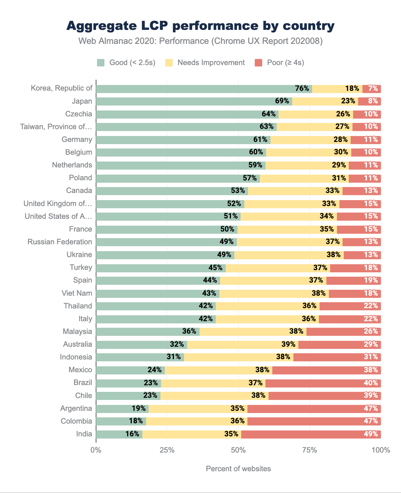
The highest percentage of good LCP readings is mostly distributed amongst European and Asian countries with the Republic of Korea (South Korea) leading at 76% of good metric readings. South Korea is a consistent leader in mobile speeds, with an impressive 145 Mbps download reported by Speedtest Global Index for October. Japan, Czechia, Taiwan, Germany and Belgium are also a handful of countries with reliably high mobile speeds. Australia, while leading in mobile network speeds, is let down by slow desktop connections and latency which places it at the bottom section of the ranking above.
India remains the last one in our set of data, with only 16% of good experiences. While the population of people connecting to the internet for the first time is continually growing, the mobile and desktop network speeds are still an issue, with average downloads of 10Mbps for 4G, 3Mbps for 3G and below 50Mbps for desktop.
LCP by connection type
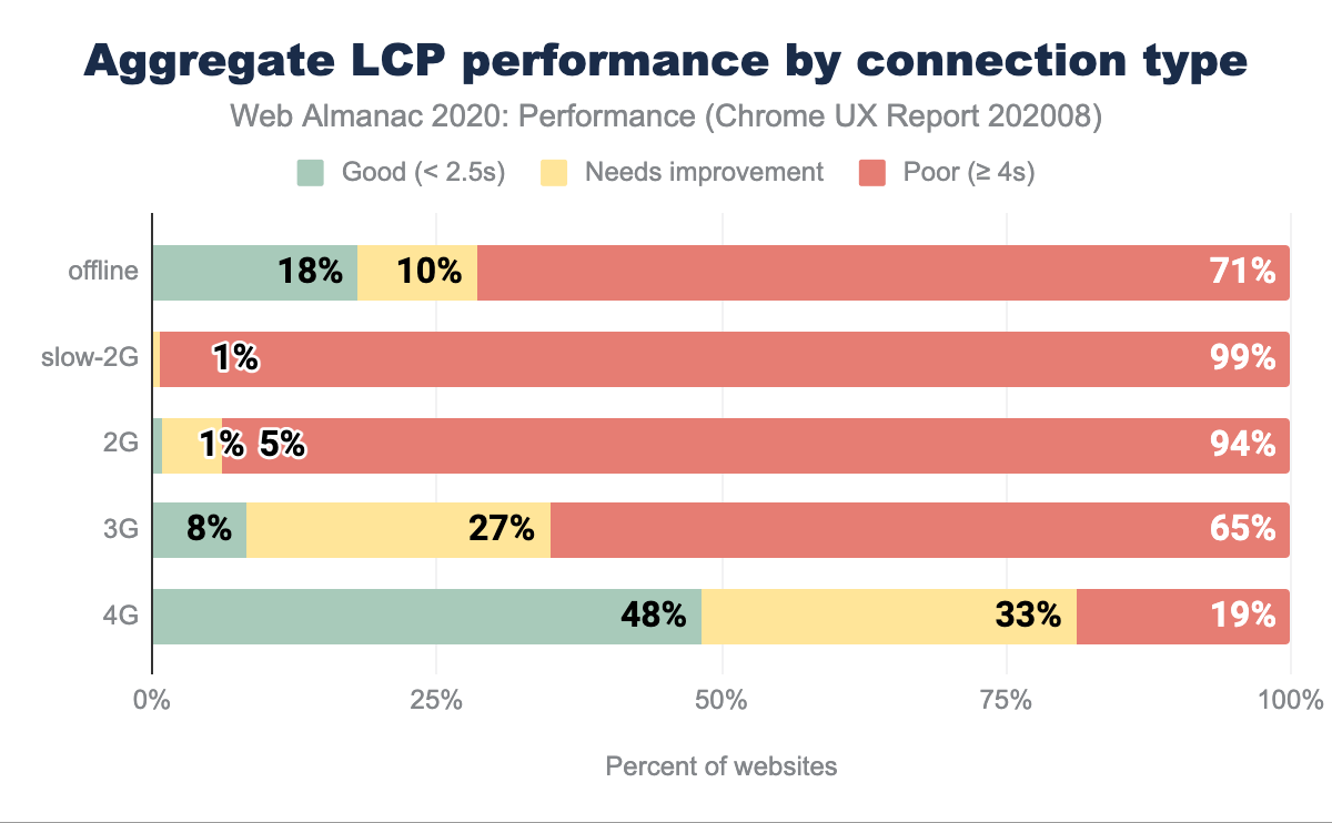
Since LCP is a timing showcasing when the largest above-the-fold element has been rendered (including imagery, videos or block-level elements containing text), it is not surprising that the slower the network, the more significant portion of measurements are poor.
There’s a clear correlation of network speed and better LCP performance, but even on 4G, only 48% of results are categorized as good, leaving half of the readings in need of an improvement. Automating media optimization, serving the right dimensions and formats, as well as optimizing for Low Data Mode, could help move the needle. Learn more about optimizing LCP in this guide.
Core Web Vitals: Cumulative Layout Shift
Cumulative Layout Shift (CLS) quantifies how much elements within the viewport move around during the page visit. It helps pinpoint the degree to which unexpected movement occurs on your websites to grade the user experience, rather than attempting to measure a specific part of interaction with the help of a unit like seconds or milliseconds.
In that way, CLS is a different, new type of a UX holistic metric in comparison to others mentioned in this chapter.
CLS by device
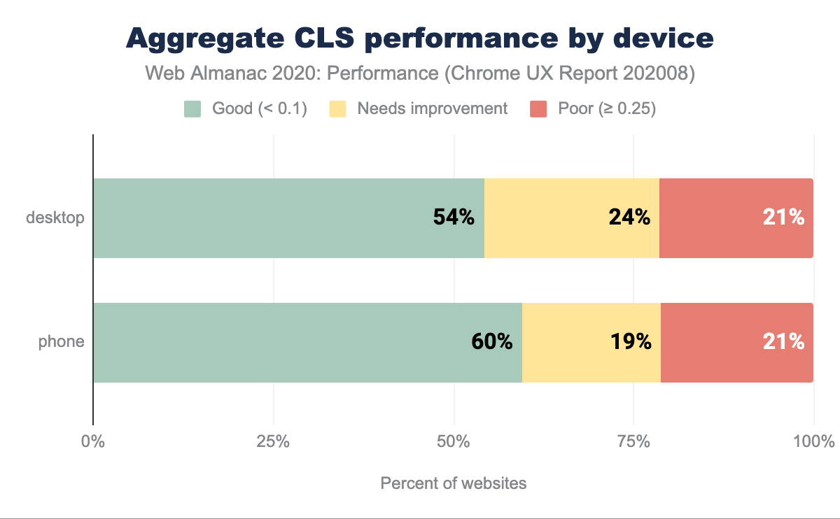
According to CrUX data, both in cases of desktop and mobile devices, more than half of the websites have a good CLS score. There’s a slight difference (6 percentage points) between the number of good-rated websites between desktop and mobile, favoring the latter. We could speculate that phones lead in good CLS ratings due to mobile-optimized experiences that tend to be less feature and visuals-rich.
CLS by geographic location
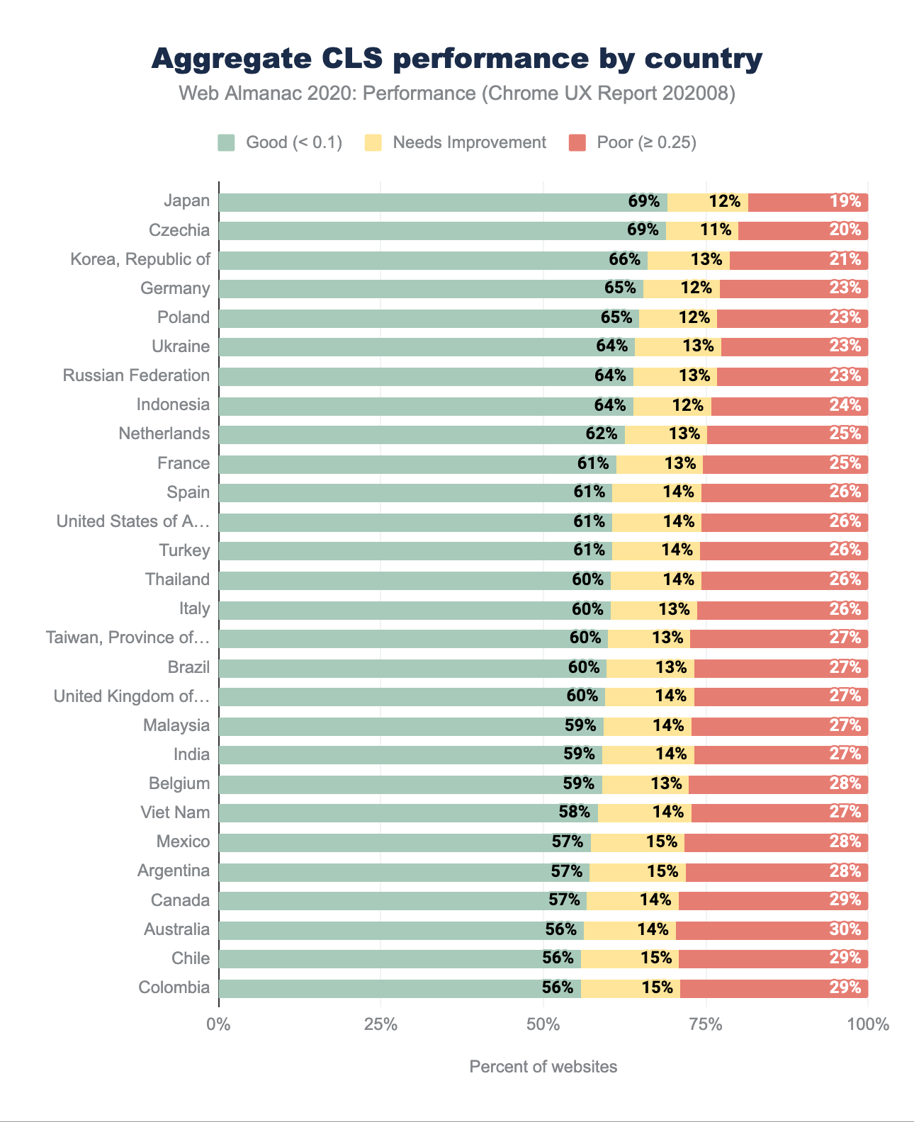
The CLS performance in different geographical regions is primarily good, with at least 56% of sites with a good rating. This is excellent news for perceived visual stability. We can observe similar countries leading as we’ve seen in the LCP geo-distribution—Republic of Korea, Japan, Czechia, Germany, Poland.
Visual stability is less affected by geography and latency to other metrics, like LCP. The difference in the percentage of good scores between the top and the bottom country is 61% for LCP and only 13% for CLS. The percentage of moderate-rating websites is relatively low across the board, giving way to 19%-29% of poor experiences across the board. There are numerous factors that can contribute to poor CLS—learn how to address them in the Optimize Cumulative Layout Shift guide.
CLS by connection type
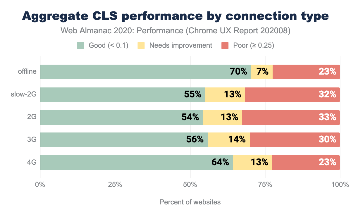
There’s a reasonably even distribution of CLS scoring across most connection types except for offline and 4G. In the offline scenario, we can speculate that Service Workers serve websites. Consequently, there’s no delay in download caused by connection type, resulting in the most significant portion of good grades.
It is challenging to draw definite conclusions about 4G, but we can speculate that perhaps 4G+ connections are used as a method of internet access on desktop devices. If that assumption was valid, web fonts and imagery could be heavily cached, which positively affects CLS measurements.
Core Web Vitals: First Input Delay
First Input Delay (FID) measures the time between first user interaction and when the browser is able to respond to that interaction. FID is a good indicator of how interactive your websites are.
FID by device
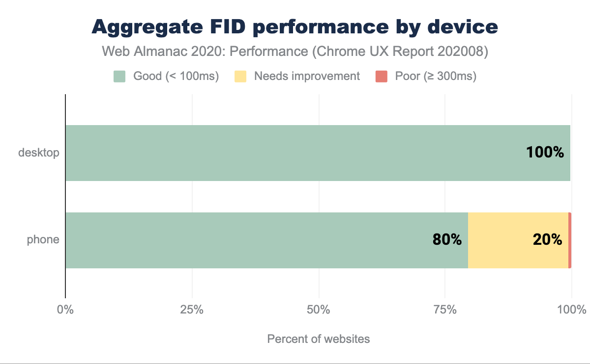
It is relatively uncommon to see good scores distributed across such a high percentage of websites. On desktop, based on the 75th percentile of sites’ distributions, 100% of sites report fast timings for FID, meaning the number of people experiencing interaction delays is very low.
On mobile, 80% of sites are graded as good. A likely explanation is the reduced CPU capabilities in comparison to desktop, network latency on mobile (causing a delay in script download and execution) as well as battery efficiency and temperature limitations, capping the CPU potential of mobile devices. All of which directly affect interactivity metrics like FID.
FID by geographic location
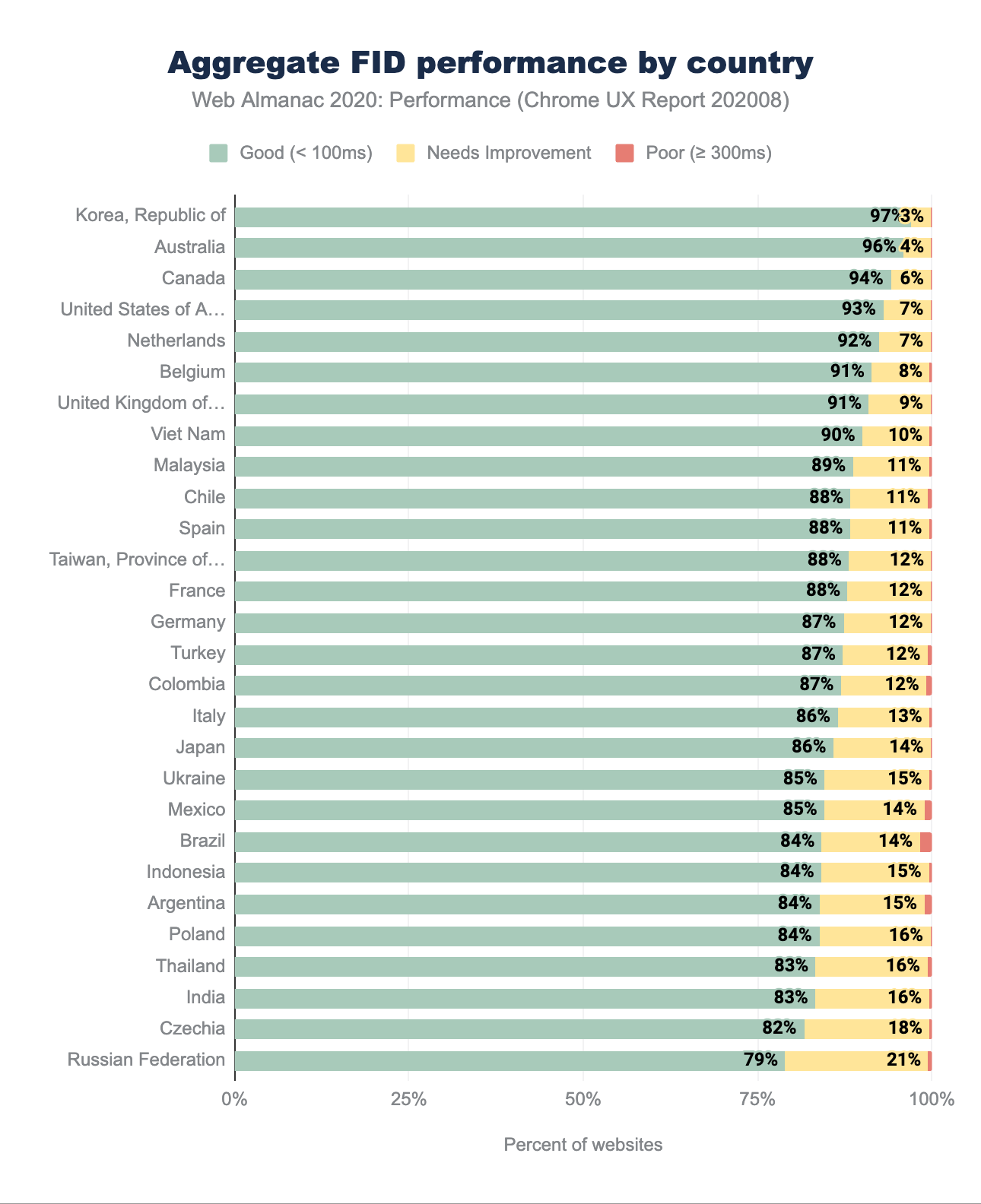
The geographic distribution of FID scoring confirms the findings in the aggregate device chart shared earlier on. At worst, 79% of websites have good FID, with an impressive 97% on the top position with the Republic of Korea leading again. Interestingly, some top contenders from the CLS and LCP ranking, such as Czechia, Poland, Ukraine and Russian Federation here fall to the bottom of the hierarchy.
Again, we can speculate why that might be, but would need further analysis to really be sure. Assuming FID correlates to JavaScript execution capabilities, countries where more capable devices are more expensive and treated as luxury items, might report lower FID ranking. Poland is a good example—with one of the highest iPhone prices compared to the US market, combined with relatively lower wages, a single salary isn’t sufficient to purchase Apple’s flagship product. To contrast, Australians with average salaries would be able to buy an iPhone with a weeks’ worth of pay. Luckily, the percentage of websites with a low rating is mostly at 0, with a few exceptions of 1-2% readings, pointing towards a relatively speedy response to the interaction.
FID by connection type
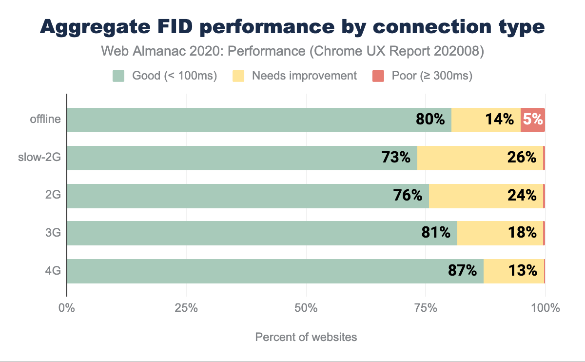
We can observe a direct correlation between network speed and fast FID, ranging from 73% on 2G to 87% on 4G networks. Faster networks will aid in speedier script download, which consequently speeds up the beginning of the parsing and fewer tasks blocking the main thread. It is optimistic to see such results, especially when the ratio of poorly rated site experiences doesn’t exceed 5%.
First Contentful Paint
First Contentful Paint (FCP) measures the first time at which the browser rendered any text, image, non-white canvas or SVG content. FCP is a good indicator of perceived speed as it portrays how long people wait to see the first signs of a site loading.
FCP by device
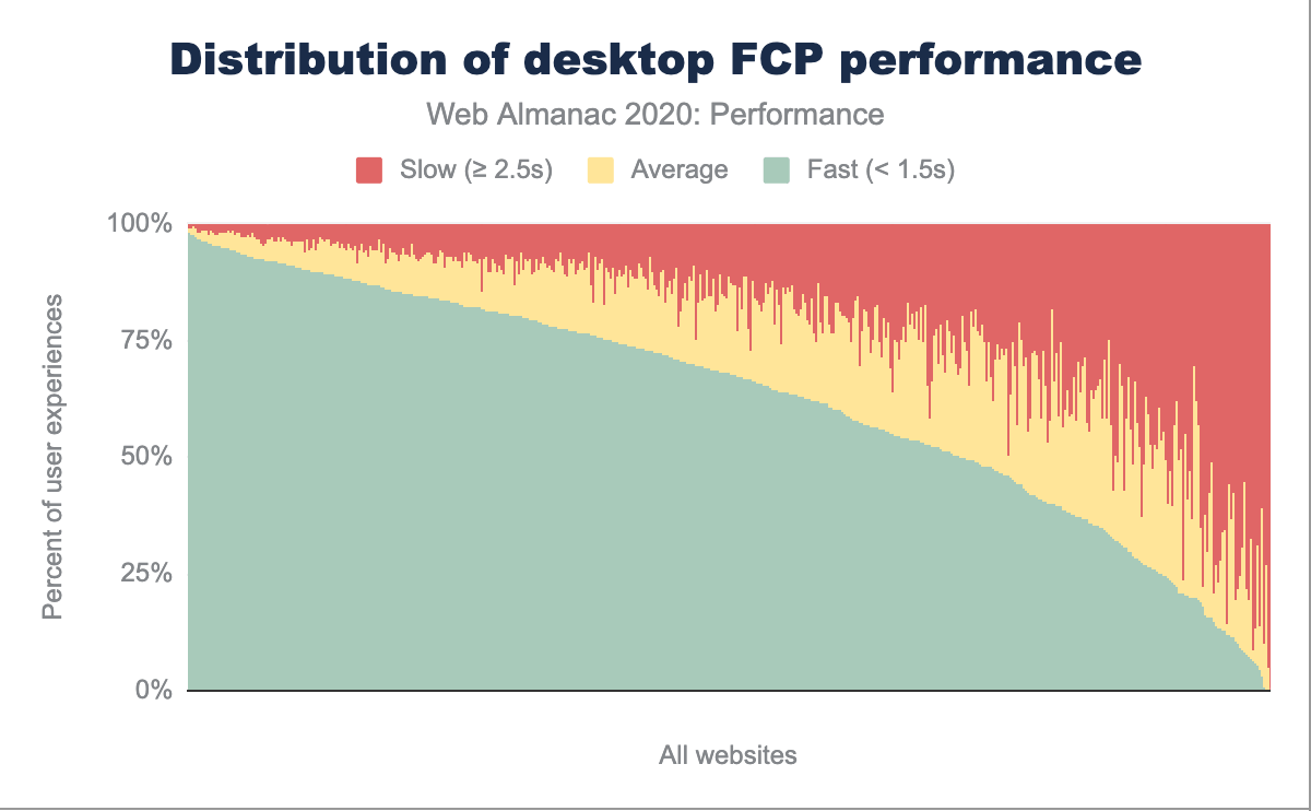
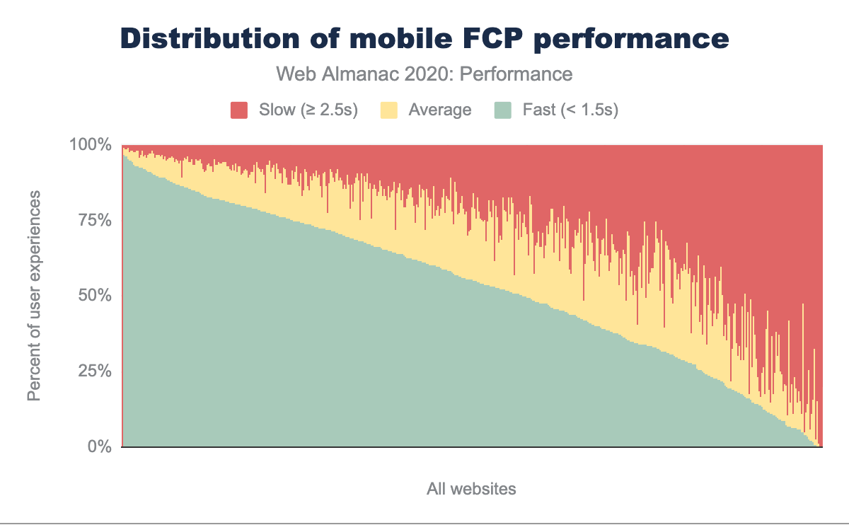
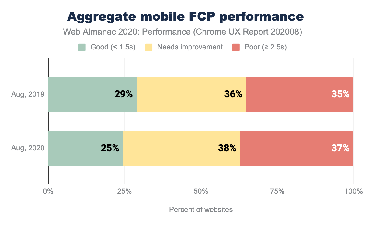
In the charts above, the FCP distributions are broken down by desktop and mobile. Comparing to last year, there are noticeably less average FCP readings, while the percentage of fast and slow user experiences has risen no matter the device type. We can still observe the same trend, where mobile users will experience slower FCP more frequently than desktop users. Overall, users are more likely to have a good or poor experience, rather than a mediocre experience.
Comparing FCP on mobile devices on a year-over-year basis, we observe fewer good experiences and more moderate and poor experiences. 75% of websites have sub-par FCP. We can speculate this high percentage of less than ideal FCP readings is a source of frustration and degraded user experience.
Numerous factors can delay paints, such as server latency (measured by a handful of metrics, such as Time to First Byte (TTFB) and RTT), blocking JavaScript requests, or inappropriate handling of custom fonts to name a few.
FCP by geographic location
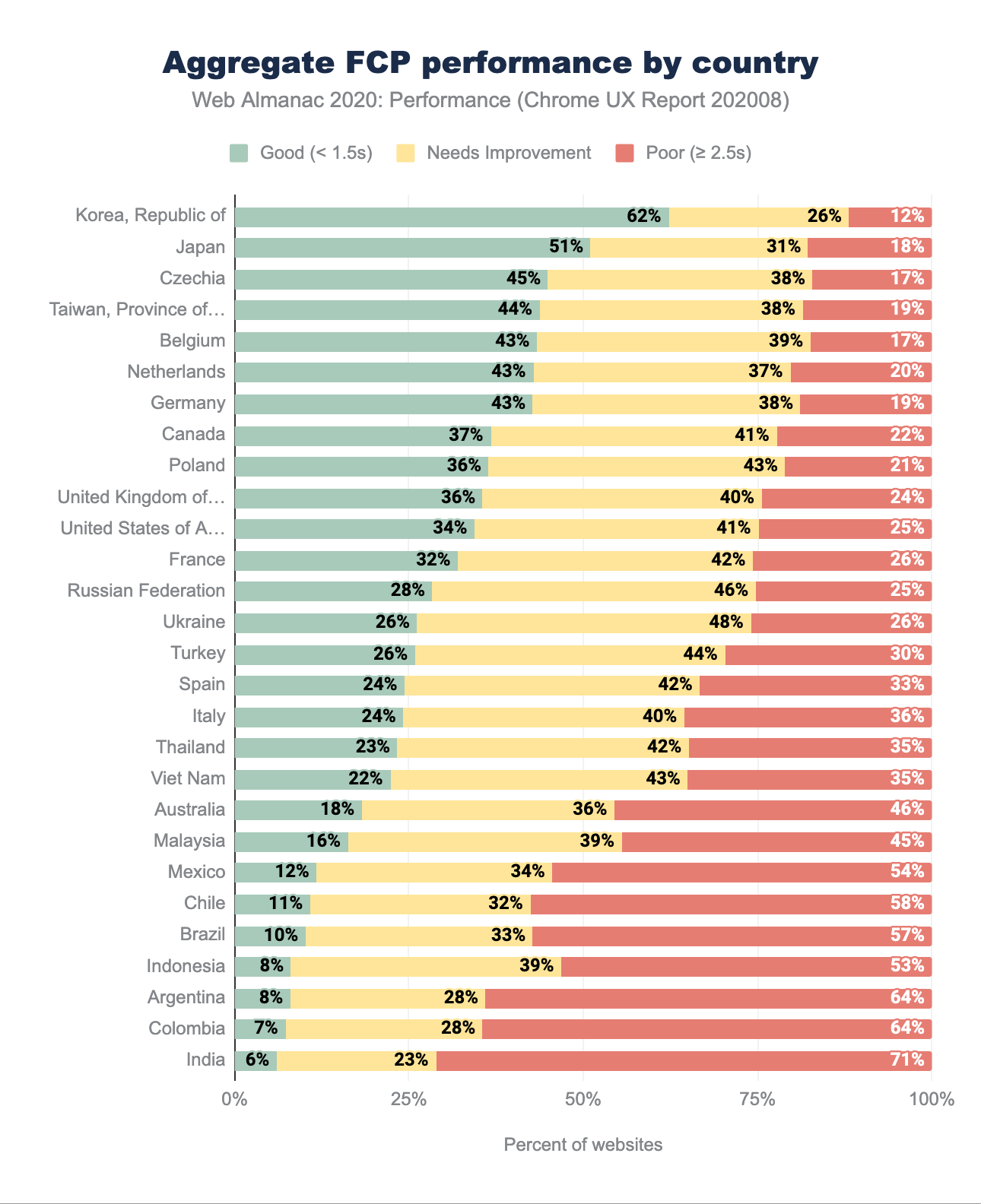
Before we dig into the analysis, it is noteworthy to mention that in the 2019 Performance chapter, the thresholds for “good” and “poor” classification were different from 2020. In 2019, sites with FCP below 1s were considered good, while those with FCP above 3s were categorized as poor. In 2020, those ranges shifted to 1.5s for good and 2.5s for poor.
This change means that the distribution would shift towards more “good” and “poor” rated websites. We can observe that trend compared to last year’s results, as the percentage of good and poor websites rise. The top ten geographies with the highest rate of fast websites remain relatively unchanged from 2019, with the addition of Czechia and Belgium and the fall of the United States and the United Kingdom. The Republic of Korea leads with 62% of websites reporting fast FCP, nearly doubling since last year (which, again, is likely due to re-categorization of results). Other countries in the top of the ranking also double the number of good experiences.
While the mediocre (“needs improvement”) percentage becomes smaller, the number of poorly performing FCP sites rises, which is especially pronounced at the bottom of the ranking with Latin American and South Asian regions.
Again, there are several reasons negatively affecting FCP, such as poor TTFB readings, but it is difficult to prove them without the necessary context. For example, if we were to analyze specific country performance, such as Australia, we surprisingly find it at the lower end. Australia has one of the highest global smartphone penetration levels, one of the fastest mobile networks and relatively high average income levels. We’d easily assume it should be higher up. However, taking into account slow fixed connections, latency and lack of iOS representation in CrUX, its positioning starts making more sense. With an example like this (touched only on the surface), we can see how difficult understanding context for each of the countries would be.
FCP by connection type
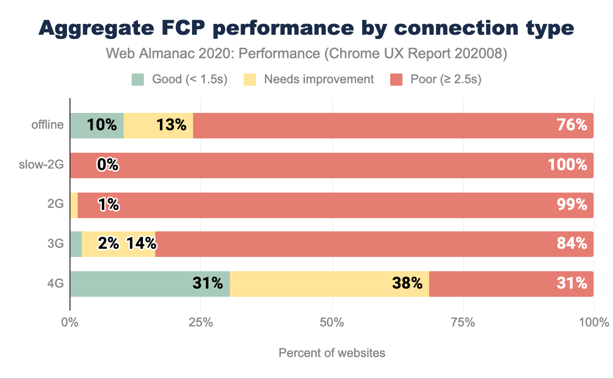
Similarly to other metrics, FCP is affected by connection speeds. On 3G, only 2% of experiences rate good, while on 4G, 31%. It is not an ideal state of FCP performance, but it has improved since 2019 in some areas, which again might be driven by the change in categorization of good and poor categorization. We see the same rise in the percentage of good websites and poor websites, narrowing the number of moderate (“needs improvement”) site experiences.
This trend illustrates the furthering digital divide, where experiences on slower networks and potentially less capable devices are consistently worse. Improving FCP on slow connections directly correlates to enhancing TTFB, which we observe in Aggregate TTFB performance by connection type chart—poor TTFB = poor FCP.
The choice of hosting provider or CDN will have a cascading effect on speed. Making these decisions based on the fastest possible delivery will help in improving FCP and TTFB, especially on slower networks. FCP is also significantly affected by font load time, so ensuring text is visible while web fonts are downloaded is also a worthwhile strategy (especially where on slower connections these resources will be costly to fetch).
Looking at the “offline” statistics, we can deduce that a substantial number of FCP issues are also not correlated to the network type. We don’t observe significant gains in this category, which we would if that statement was true. It appears would seem rendering is not so much delayed by fetching JavaScript, but it is affected by parsing and execution.
Time to First Byte
Time to First Byte (TTFB) is the time taken from the initial HTML request being made until the first byte arrives back to the browser. Issues with swiftly processing requests can quickly cascade into affecting other performance metrics as they will delay not only paints but also any resource fetching.
TTFB by device
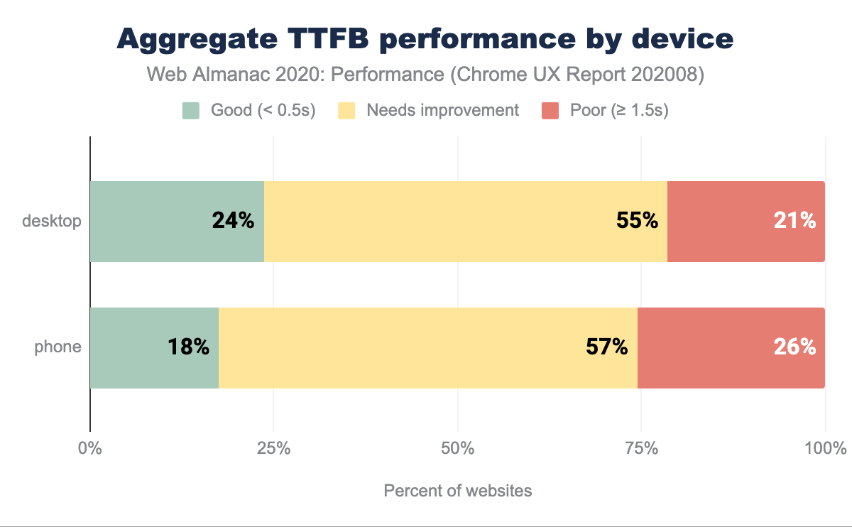
On desktop, 76% of websites have a “not good” TTFB, while on mobile, that percentage rises to 83%. We might assume that the data portrays how TTFB is often an overlooked metric when it is assumed that most performance measurements and work is concentrated within front-end and visual rendering, not asset delivery and server-side work. High TTFB will have a direct, negative impact on a plethora of other performance signals, which is an area that still needs addressing.
TTFB by geographic location
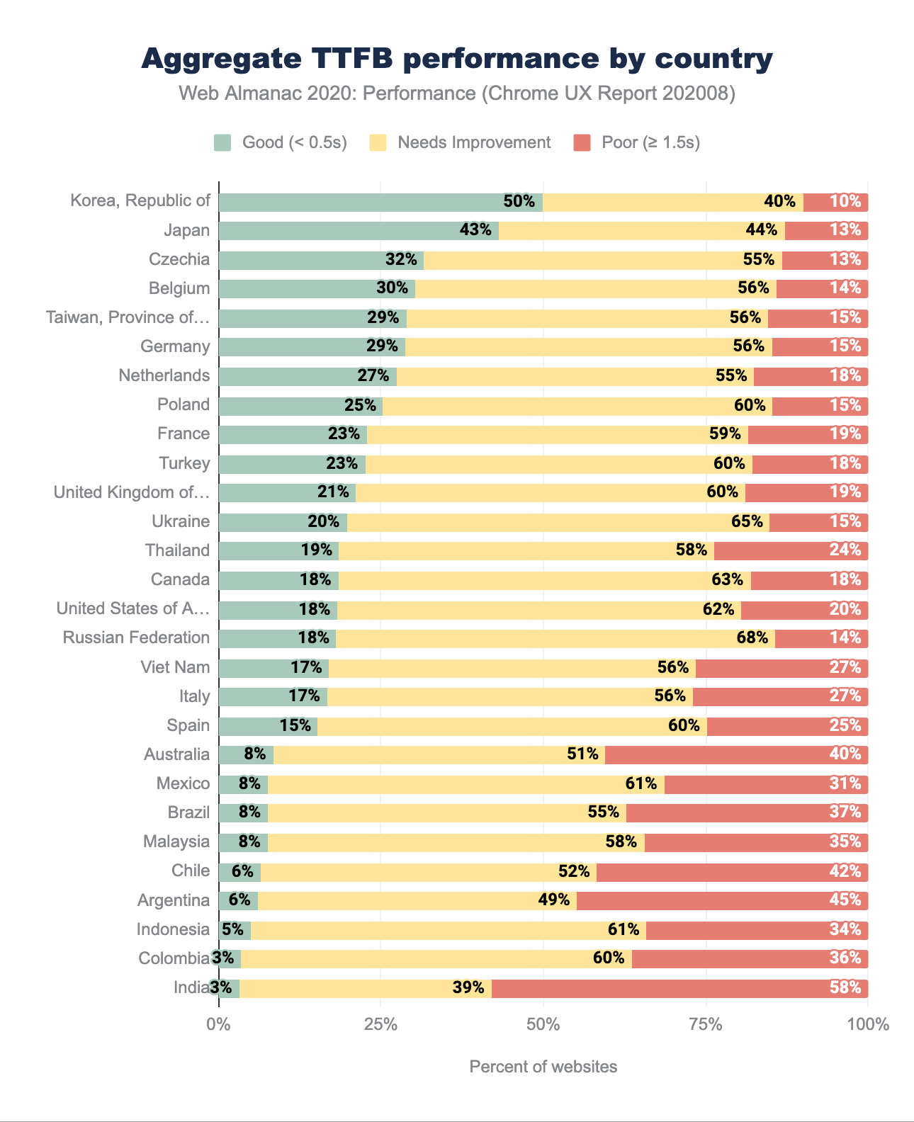
Likening this years’ TTFB geo readings to 2019 results again points to more fast websites, but similarly to FCP, the thresholds have changed. Previously, we considered TTFB below 200ms fast, and above 1000ms slow. In 2020, TTFB below 500ms is good and above 1500ms poor. Such generous changes in categorization can explain that we observe significant changes, such as a 36% rise in good website experiences in The Republic of Korea or 22% rise in Taiwan. Overall, we still observe similar regions, such as Asia-Pacific and selected European locales leading.
TTFB by connection type
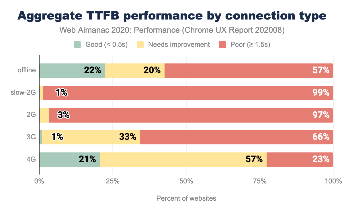
TTFB is affected by network latency and connection type. The higher the latency and the slower the connection, the worse TTFB measurements, as we can observe above. Even on mobile connections considered as fast (4G), only 21% of websites have a fast TTFB. There are nearly no sites categorized as quick below 4G speeds.
Looking at the mobile speeds worldwide for December 2018-November 2019, we can see that globally, mobile connections aren’t high-speed. Those network speeds and technology standards for cellular networks (such as 5G) are not evenly distributed and affect TTFB. As an example, see this map of networks in Nigeria—most of the country area has 2G and 3G coverage, with little 4G range.
What’s surprising is the relatively the same number of good TTFB results between offline and 4G origins. With service workers, we could expect some of the TTFB issues to be mitigated, but that trend is not reflected in the chart above.
Performance Observer usage
There are dozens of different user-centric metrics that can be used to assess websites and applications. However, sometimes the predefined metrics don’t quite fit our specific scenarios and needs. The PerformanceObserver API allows us to obtain custom metric data obtained with User Timing API, Long Task API, Event Timing API and a handful of other low-level APIs. For example, with their help, we could record the timing transitions between pages or quantify server-side-rendered (SSR) application hydration.
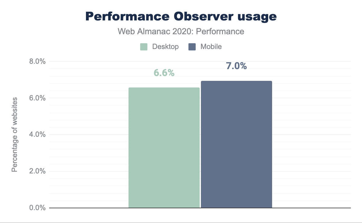
The chart above showcases that Performance Observer is used by 6-7% of tracked sites, depending on device type. Those websites will be leveraging the low-level APIs to create custom metrics, and the PerformanceObserver API to collate them, and then potentially use it with other performance reporting tooling. Such adoption rates might indicate the tendency to lean on predefined metrics (for example, coming from Lighthouse), but also are impressive for a relatively niche API.
Conclusion
User experience is not only a spectrum but also depends on a wide variety of factors. To attempt understanding the state of performance without excluding the sub-par, underprivileged experiences, we must approach it intersectionally. Each website visit tells a story. Our personal and country-level socioeconomic status dictates the type of device and internet provider we can afford. The geopositioning of where we live affects latency (we Australians feel this pain regularly), and the economy dictates available cellular network coverage. What websites do we visit? What do we visit them for? Context is critical to not only analyzing data but also developing necessary empathy and care in building accessible, fast experiences for all.
On the surface, we have seen optimistic signals about the new Core Web Vitals performance metrics. At least half of the experiences are good across both desktop and mobile devices, if we don’t narrow down to consistently poor experiences on slower networks for Largest Contentful Paint. While the newer metrics might suggest that there’s an ongoing uptake in addressing performance issues, the lack of significant improvements in First Contentful Paint and Time to First Byte is sobering. Here the same network types are most disadvantaged as with Largest Contentful Paint, as well as fast connections and desktop devices. The Performance Score also portrays a decline in speed (or perhaps, a more accurate portrayal than what we measured in the past).
What the data shows us, is that we must keep investing in improving performance for scenarios (such as slower connectivity) that we often don’t experience due to multiple aspects of our privilege (middle to high-income countries, high pay and new, capable devices). It also highlights that there’s still plenty of work to be done in the areas of speeding up initial paints (LCP and FCP) and asset delivery (TTFB). Often, performance feels like an inherently front-end issue, while numerous significant improvements can be achieved on the back-end and through appropriate infrastructure choices. Again, user experience is a spectrum that depends on a variety of factors, and we need to treat it holistically.
New metrics bring new lenses to analyze user experience through, but we must not forget existing signals. Let’s focus on moving the needle in the areas that need the most improvement and will result in positive shifts in experience for most underserved. Fast and accessible internet is a human right.
