Accessibility

Introduction
Every year the internet grows—as of January 2021 there are 4.66 billion active internet users. Unfortunately, accessibility is not substantially improving alongside this growth as we’ll see throughout this chapter. As our reliance on internet solutions increases, so does the alienation of people who do not have equal access to the web.
2021 marked the second year of the ongoing COVID-19 pandemic. It is apparent that the disabled population is increasing as a result of long-term effects from COVID -19. In tandem with the long-term health effects of COVID-19, society as a whole has become increasingly dependent on digital services as a result of the pandemic. Everyone is spending more time online and completing more essential activities online as well. According to the Statistics Canada Internet Use Survey, “75% of Canadians 15 years of age and older engaged in various Internet-related activities more often since the onset of the pandemic”.
Products and services are also rapidly shifting online as a result of the pandemic. According to this McKinsey report, “Perhaps more surprising is the speedup in creating digital or digitally enhanced offerings. Across regions, the results suggest a seven-year increase, on average, in the rate at which companies are developing these [online] products and services.”
Web accessibility is about giving complete access to all aspects of an interface to people with disabilities by achieving feature and information parity. A digital product or website is simply not complete if it is not usable by everyone. If a digital product excludes certain disabled populations, this is discrimination and potentially grounds for fines and/or lawsuits. Last year lawsuits related to the Americans with Disabilities Act were up 20%.
Sadly, year over year, we and other teams conducting analysis such as the WebAIM Million are finding very little improvement in these metrics. The WebAIM study found that 97.4% of home pages had automatically detected accessibility failures, which is less than 1% lower than the 2020 audit.
The median overall site score for all Lighthouse Accessibility audit data rose from 80% in 2020 to 82% in 2021. We hope that this 2% increase represents a shift in the right direction. However, these are automated checks, and this could also potentially mean that developers are doing a better job of subverting the rule engine.
Because our analysis is based on automated metrics only, it is important to remember that automated testing captures only a fraction of the accessibility barriers that can be present in an interface. Qualitative analysis, including manual testing and usability testing with people with disabilities, is needed in order to achieve an accessible website or application.
We’ve split up our most interesting insights into six categories:
- Ease of reading
- Ease of page navigation
- Forms
- Media on the Web
- Supporting Assistive technology with ARIA
- Accessibility Overlays
We hope that this chapter, full of sobering metrics and demonstrable accessibility negligence on the Web, will inspire readers to prioritize this work and change their practices, shifting towards a more inclusive internet.
Ease of reading
Making content as simple and clear to read as possible is an important aspect of web accessibility. When people are unable to read the content of a page, not only are they unable to access its information, they are also prevented from being able to complete tasks such as registering for an account or making a purchase.
There are many aspects of a web page that make it easier or harder to read, including color contrast, zooming and scaling of pages, and language identification.
Color contrast
Color contrast refers to how easily text and other page artifacts stand out against the surrounding background. The higher the contrast, the easier it is for people to distinguish the content. The Web Content Accessibility Guidelines (WCAG) has minimum contrast requirements for text and non-text content.
People who may have difficulties viewing low contrast content include those with color vision deficiency, people with mild to moderate vision loss, and those with situational difficulties viewing the content, such as glare on screens in bright light.
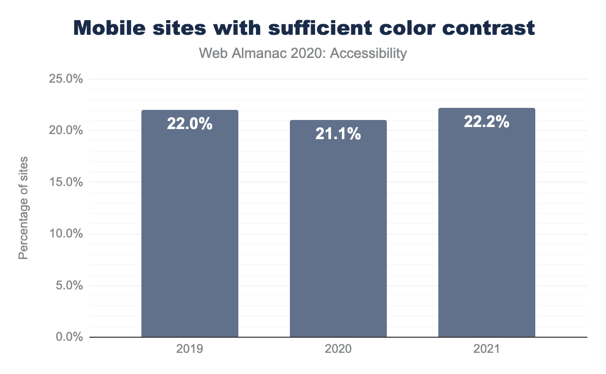
This year we found that only 22% of sites have passing color contrast scores in Lighthouse. It is worth noting that these scans are only able to catch text-based contrast issues, as non-text content is so variable. This score has stayed about the same year over year; it was 21% in 2020 and 22% in 2019. This metric is somewhat disheartening, as catching text-based contrast issues is possible with a variety of common automated tools.
Zooming and scaling
Users with low vision may rely on zooming and scaling the page using system settings or screen magnifying software in order to view its content, especially text. The Web Content Accessibility Guidelines require that text in particular can be resized up to at least 200%.
Adrian Roselli wrote a comprehensive article about the various harms caused when zooming is not enabled for users. Many browsers now prevent developers from overriding zoom controls, but it must be avoided at the code-level, as we cannot count on every browser overriding this behavior when we consider the wide range of browser and OS usage on a global scale.
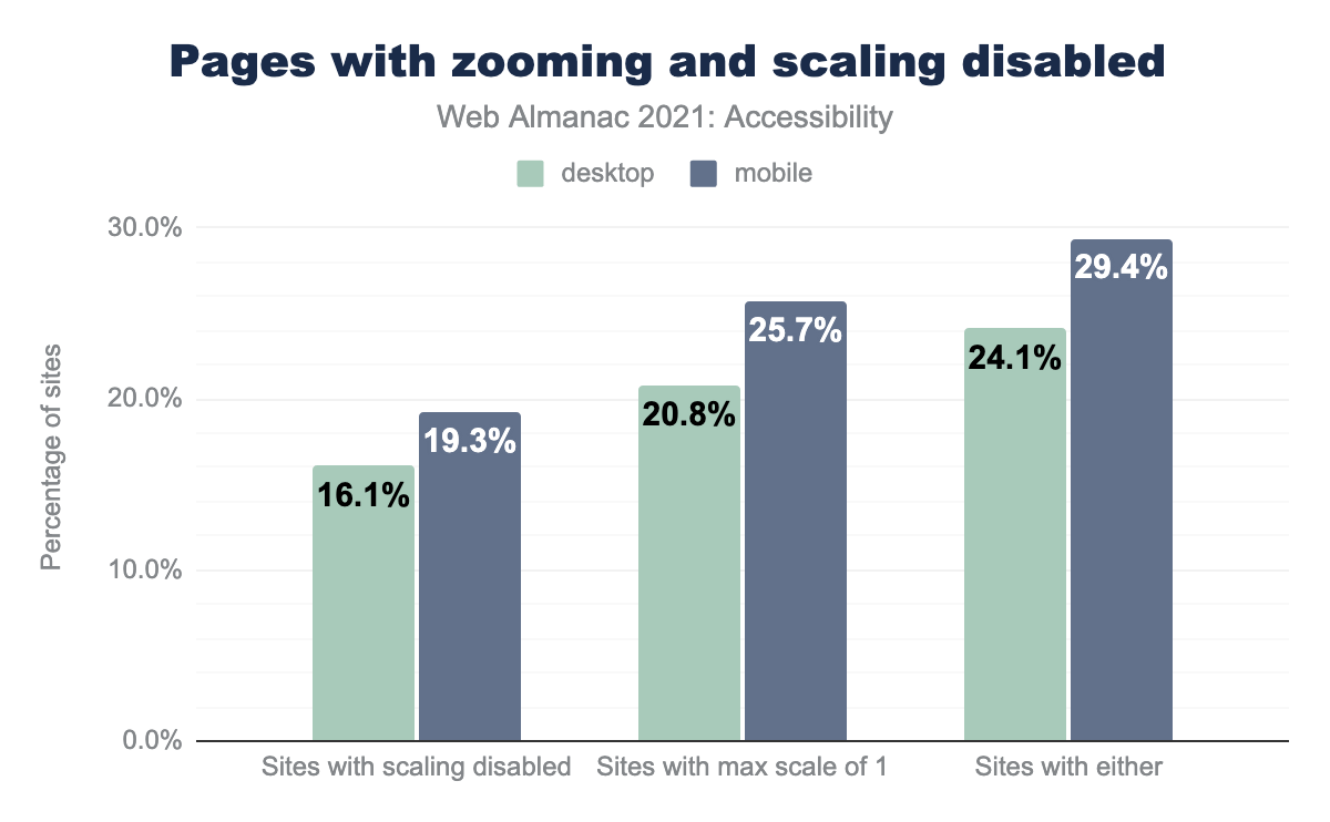
We found that 24% of desktop home pages and 29% of mobile home pages attempt to disable scaling by setting either maximum-scale to a value less than or equal to 1, or user-scalable set to 0 or none.
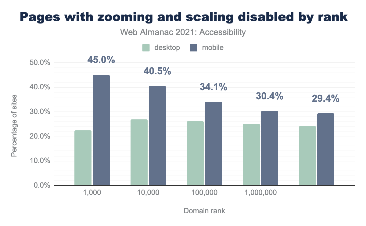
When we consider the most popular sites in particular, the numbers for mobile are especially concerning. Of the top 1,000 most trafficked sites, 22% of desktop sites and 45% of mobile sites have code that attempts to disable user scaling. This may be a trend that comes from the proliferation of web applications. People need to be able to customize their web browsing experience (such as zooming and scaling) regardless of whether the content is a website or web application.
Language identification
lang attribute.
Setting an HTML lang attribute allows easy translation of a page and better screen reader support, allowing some screen readers to apply the appropriate accent and inflection to the text being read. The percentage of sites with a lang attribute increased this year to 81% (up from 78% in 2020), and of the sites that have the attribute present, 99.7% had a valid lang attribute.
Font size and line height
There is no specific requirement from the WCAG with respect to minimum font size or line height, however there is a general consensus that a base font size of 16px or higher will help everyone with readability, especially those who have low vision. There is, however, a requirement that text can be zoomed in and resized up to 200%. Users can also set their own minimum font size at the browser level and these customized settings need to be supported.
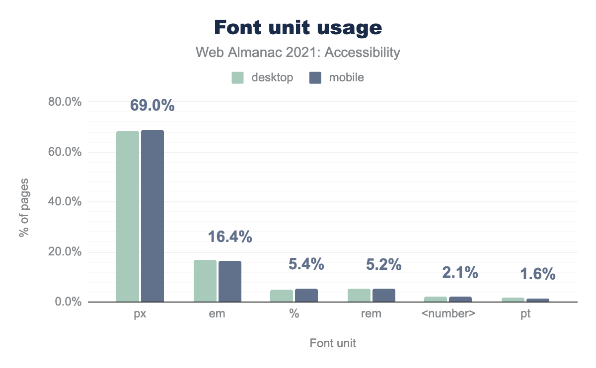
px is used for font sizes on 68.4% of desktop pages and 69.0% of mobiles pages, em on 16.7% and 16.4% respectively, % on 5.0% and 5.4%, rem on 5.5% and 5.2%, <number> on 2.3% and 2.1%, and finally pt on 1.8% and 1.6%.
When fonts are declared in px units, they are static sizes. The best way to ensure that fonts scale appropriately when the browser is zoomed is to use relative units such as em and rem. We found that 68% of desktop font size declarations are set in px, 17% are set in em and 5% are set with rem units.
Focus Styles
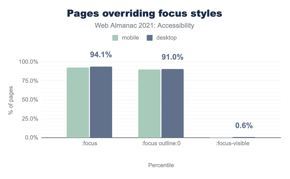
Visible focus styles are helpful for everyone but are necessary for sighted keyboard users who rely on their presence to navigate. The WCAG requires a visible focus indicator for all interactive content.
:focus pseudo class, and 90.0% of desktop sites and 91.0% of mobile sites use that :focus pseudo class to set the outline to 0 or none. 0.6% of desktop sites and 0.6% of mobile sites use the :focus-visible pseudo class.Often times, default focus indication is removed from interactive content such as buttons, form controls, and links using the CSS property :focus { outline: none; } or :focus { outline: 0; }, sometimes in conjunction with :focus-within and/or :focus-visible. We found that 91% of desktop pages have :focus { outline: 0; } declared. In some cases, it is removed so that a more effective custom style can be applied. Unfortunately, in many cases it is simply removed and never replaced, which can render a page unusable for keyboard users.
For more information about how to achieve accessible focus indication including some limitations of browser default focus styles, we recommend Sara Soueidan’s article, “A guide to designing accessible, WCAG-compliant focus indicators”.
User preference media queries and high contrast support
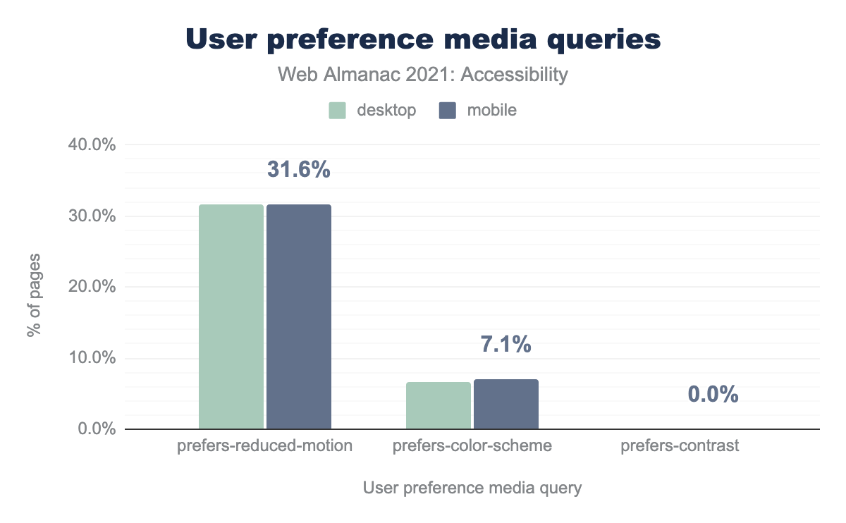
The CSS Media Queries Level 5 specification, published in 2020, introduced a collection of User Preference Media Features that allow a website to detect Accessibility features that a user may have configured outside of the website itself. These features are typically configured through operating system or platform preferences.
prefers-reduced-motion media query, 5.7% of desktop sites and 7.1% of mobile sites use prefers-color-scheme, and usage of prefers-contrast is so small on both it looks like 0.0%.
prefers-reduced-motion is used by web authors to replace animations or other sources of motion on the web page with a more static experience, typically by removing or replacing the content. This can help a range of people that may be distracted or otherwise triggered by rapid movement on the screen. We found that 32% of websites use the prefers-reduced-motion media query.
prefers-reduced-transparency indicates that the end user has asked the operating system to minimize or eliminate translucency and transparency effects. This affordance might be turned on by end users to help with reading comprehension or to avoid common “halo effects” that can negatively affect users with visual impairments. We do not have data on the usage of this relatively new media query.
prefers-contrast (high or low) suggests that the end user would prefer a high-contrast or low-contrast contrast theme. This can help with reading comprehension and eye strain. We do not have data on the usage of this relatively new media query though we found that 25% of websites use ms-high-contrast which is a Windows-specific approach to handling contrast preferences.
prefers-color-scheme (light or dark) allows a user to request light color on a dark background experience, or vice-versa. This was the earliest of the User Preference Media Queries to be introduced. This capability, commonly known as “dark mode” support, rose to prominence in 2019 after Apple standardized it in iOS 13 and iPadOS, though it had been a common accessibility feature for many years prior to that.
While dark mode is recognized by many developers and designers as an accessibility affordance, it is important to note that dark mode may, in fact, reduce accessibility for certain users. Some people with dyslexia or astigmatism might find light text on a dark background harder to read, and might find that it exacerbates the halo effect. The important takeaway here is to let your user choose what works best for them. We found that 7% of websites use the prefers-color-scheme media query.
Ease of page navigation
Navigating through web content is one of the fundamental ways we engage online and there are many ways this is accomplished. For some people, this could mean visually scanning a page while scrolling with a mouse. For others it might start by navigating through the headings on a page with their screen reader. Websites need to be easy to navigate so users are not left feeling lost or unable to find the content they are seeking.
Landmarks and page structure
Landmarks are designated HTML elements or ARIA roles we can apply to other HTML elements that enable assistive technology users to quickly understand overall page structure and navigation. For example a rotor menu can be used to navigate to different landmarks of the page, and or a skip link can be used to target the <main> landmark.
Before the introduction of HTML5, ARIA landmark roles were needed to accomplish this. However, we now have native HTML elements available to accomplish the majority of landmark page structure. Leveraging the native HTML landmark elements is preferable to applying ARIA roles, per the first rule of ARIA. For more information, see the ARIA roles section of this chapter.
| HTML5 element |
ARIA role equivalent |
Pages with element |
Pages with role |
Pages with element or role |
|---|---|---|---|---|
<main> |
role="main" |
27.68% | 16.90% | 35.00% |
<header> |
role="banner" |
62.13% | 14.34% | 63.49% |
<nav> |
role="navigation" |
61.69% | 22.79% | 65.53% |
<footer> |
role="contentinfo" |
63.35% | 12.21% | 64.52% |
The most commonly expected landmarks that the majority of web pages should have, are <main>, <header>, <nav> and <footer>. We found that only 28% of desktop pages have a native HTML <main> element, 17% of desktop pages have an element with a role="main", and 35% of pages have either.
When a page has multiple instances of the same landmark, for example, a primary site navigation and a breadcrumb secondary navigation, it is important that they each have a unique accessible name. This will help an assistive technology user to better understand which navigation landmark they have encountered. Techniques for accomplishing this are covered in Scott O’Hara’s comprehensive article about the various landmarks and how different screen readers navigate them.
Document titles
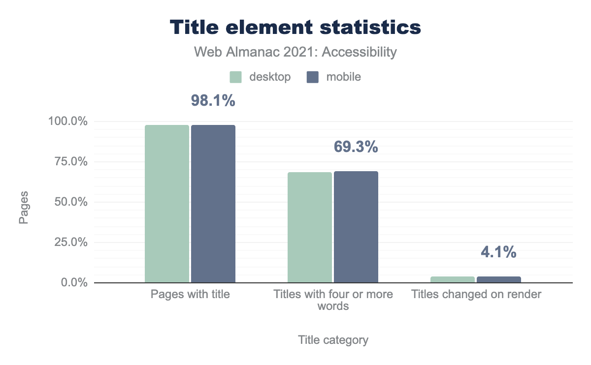
Descriptive page titles are helpful for context when moving between pages, tabs, and windows with assistive technology because the change in context will be announced.
<title> element, 68.5% and 69.3% of those titles have four or more words, and 4.1% on both desktop and mobile are changed on render.Our data shows 98% of web pages have a title. However, only 68% of those pages have a title containing four or more words, meaning that it is likely that a significant percentage of web pages do not have a unique, meaningful title that provides enough information about the content of the page.
Secondary Navigation
Many users benefit from a secondary navigation method to help them find the content they are looking for on a website. The WCAG has a requirement that complex websites have a secondary navigation method. One of the most common and helpful secondary navigation methods is a search mechanism. We found that 24% of all sites used a search input.
Another approach to providing a secondary navigation method is to implement a site map, which is a collection of all of the links available on a website clearly organized collection. Although we do not have any data about the presence of site maps, this technique guide from the W3C explains what they are in detail and how to implement one effectively.
Tabindex
tabindex is an attribute that can be added to elements to control whether it can be focused. Depending on its value, the element can also be in the keyboard focus, or “tab” order.
A tabindex value of 0 allows for an element to be programmatically focusable and in keyboard focus order. Interactive content such as buttons, links, and form controls have the equivalent of a tabindex value of 0, meaning they are in the keyboard focus order natively.
Custom elements and widgets that are intended to be interactive and in the keyboard focus order need an explicitly assigned tabindex="0", or they will not be usable by keyboard.
If an element should be focusable but not in the keyboard focus order a tabindex value of -1 (or any negative integer) can be used as a hook to enable programmatically setting focus on the element with JavaScript without adding it to the keyboard focus order. This can be helpful for cases where you’d like to assign focus, such as focusing a heading when navigating to new page within a single page application as covered by Marcy Sutton in her post on accessible client-side routing techniques. Placing non-interactive elements in keyboard focus order creates a confusing experience for blind and low vision users and should be avoided.
The focus order of the page should always be determined by the document flow meaning the order of the HTML elements in the document. Setting the tabindex to a positive integer value overrides the natural order of the page, often leading to failures of WCAG 2.4.3 - Focus Order. Respecting the natural focus order of a page generally leads to a more accessible experience than over-engineering the keyboard focus order.
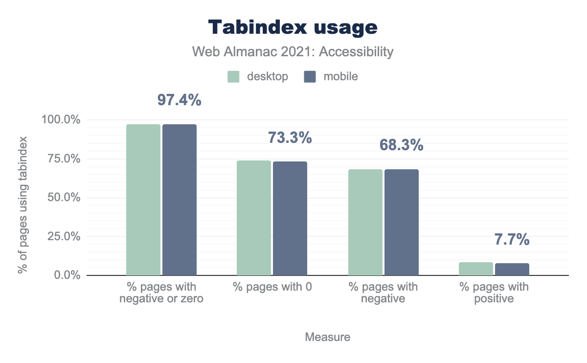
We found that 58% of desktop sites and 56% of mobile sites have some usage of the tabindex attribute.
tabindex, a negative or zero tabindex is used on 96.9% of those pages for desktop and 97.4% of those pages for mobile, a tabindex of 0 is used on 68.2% and 68.3% respectively, a negative tabindex is used on 74.2% and 73.3%, and finally a positive tabindex is used on 8.7% and 7.7%.tabindex usage.
When we look at desktop pages that have at least one instance of the tabindex attribute:
- 96.9% use a value of
0, meaning elements are focusable and being added to the keyboard focus order - 68.2% use a negative integer, meaning elements are explicitly removed from the keyboard focus order
- 8.7% have a positive integer value, meaning the web author is trying to control the focus order rather than allowing the DOM structure to do so
While there are valid declarations for the tabindex attribute, incorrectly reaching for these techniques leads to common accessibility barriers for many keyboard and assistive technology users. For more information about the pitfalls of using a positive integer for tabindex we recommend Karl Groves’ article, “Why using tabindex values greater than “0” is bad”.
Skip links
Skip links help people who rely on keyboards to navigate. They enable a user to skip through sections of content that repeat across multiple pages or navigation sections and go to another destination, typically the <main> element of the page. Skip links are typically the first element on a page and can be persistent in the UI or visibly hidden until they have keyboard focus. For example, a lot of interactive content (such as a robust navigation system full of links), can be incredibly cumbersome to tab through before reaching the main content of the screen, especially as these tend to be repeated across multiple pages.
Some websites that are very information dense have several skip links to allow users to jump to the commonly trafficked areas of the site. For example, the government of Canada’s website has “skip to main content”, “skip to about government” and “switch to basic HTML version”.
Skip links are considered a bypass for a block. There is no way for us to query for all possible skip link implementations, however we found that close to 20% of desktop and mobile sites likely have a skip link. We determined this by looking for the presence of an href="#main" attribute on one of the first three links on the page, which is a common implementation for a skip link.
Heading hierarchy
Headings make it easier for screen readers to properly navigate a page by supplying a hierarchy that can be jumped through like a table of contents.
Our audits revealed that 58% of the sites checked pass the test for properly ordered headings that do not skip levels. Over 85% of screen reader users surveyed in 2021 by WebAIM reported they find headings useful in navigating the web. Having headings in the correct order–ascending without skipping levels–means that assistive technology users will have the best experience.
Tables
Tables are an efficient way to display data with two axes of relationships, making them useful for comparisons. Users of assistive technology rely on specific table markup that provides a machine-readable structure so the user can effectively navigate, understand and interact with them.
Tables should have a well-formatted structure with the appropriate elements and defined relationships, including a caption, appropriate headers and footers, and a corresponding header cell for every data cell. Screen reader users rely on such well-defined relationships through what is announced, so an incomplete or an incorrectly declared structure can lead to misleading or missing information.
| Table sites | All sites | |||
|---|---|---|---|---|
| Desktop | Mobile | Desktop | Mobile | |
| Captioned tables | 5.4% | 4.6% | 1.2% | 1.0% |
| Presentational table | 1.2% | 0.9% | 0.5% | 0.4% |
Table captions
Table captions act as a heading for the full table to provide a summary of its information. When labelling a table, the <caption> element is the correct semantic choice to provide the most context to a screen reader user, though it should be noted that there are also other alternative captioning techniques for tables.
Heading elements for the full table are frequently unnecessary when a <caption> element has been properly implemented, and the <caption> element can be styled and visually positioned in a way that resembles a heading. Only 5% of desktop and mobile sites with table elements present used a <caption>, which is a slight increase from 2020.
Tables for layout
The introduction of CSS methodologies such as Flexbox and Grid provided the capability for web developers to easily create fluid responsive layouts. Prior to this development, developers frequently used tables for layout instead of presenting data. Unfortunately, due to a combination of legacy websites and legacy development techniques, websites still exist where tables are used for layout. It is difficult to determine how widely this legacy development technique is still used.
If there is an absolute need to reach for this technique, the role of presentation should be applied to the table such that assistive technology will ignore the table semantics. We found that 1% of desktop and mobile pages contain a table with a role of presentation. It’s hard to know if this is good or bad. It could indicate that there are not many tables used for presentational purposes, but it is very likely that tables used for layout are just lacking this needed role.
Tabs
Tabs are a very common interface widget but making them accessible presents a challenge for many developers. A common pattern for accessible implementation comes from the WAI-ARIA Authoring Practices Design Patterns. Note that the ARIA Authoring Practices document is not a specification and is meant to demonstrate idealized use of ARIA for common widgets. They should not be used in production without testing with your users.
The Authoring Practice guidelines suggest always using the tabpanel role in conjunction with role="tab". We found that 8% of desktop pages have at least one element with a role="tablist", 7% of pages have elements with a role="tab" and 6% of pages have elements with a role="tabpanel". For more information see the ARIA roles section below.
Captchas
Public websites regularly have two different types of visitors—humans and computers that crawl the web. To attract human visitors, websites hope to be featured prominently by search engines. Search engines, in turn, send out automated programs called web crawlers to visit websites, look around, and report their findings back to the search engine to classify and organize their content.
For example, The Web Almanac is created each year by sending out a similar kind of web crawler to gather information about roughly 8 million different websites. Authors then summarize the results for your reading pleasure.
For cases where websites want to verify that the visitor is a human, one technique web authors sometimes use is putting up a test that a human can theoretically pass, and a computer cannot. These types of “human-only” tests are called a CAPTCHA— “Completely Automated Public Turing Test, to Tell Computers and Humans Apart”.
We found CAPTCHAs on roughly 10% of the websites visited, across both desktop and mobile sites.
CAPTCHAs present a host of potential accessibility barriers. For example, one of the most common forms of a CAPTCHA presents an image of wavy, distorted text and asks the user to decipher the text and type it in. This type of test can be difficult to solve for everyone but would likely be more difficult for people with low vision and other vision or reading related disabilities. One usability survey found that roughly 1 out of 3 users failed to successfully decipher a CAPTCHA on the first try.
If CAPTCHAs include alt text, the test would be trivial to pass by a computer since the answer is provided as plain text. However, by not including alt text, CAPCHAs are excluding screen readers and the blind or low vision users who use them.
For more information on the accessibility barriers that CAPTCHAs present, we recommend the W3C paper: “Inaccessibility of CAPTCHA: Alternatives to Visual Turing Tests on the Web”.
From the paper: “It is important to acknowledge that using a CAPTCHA as a security solution is becoming increasingly ineffective… Alternative security methods, such as two-step or multi-device verification, along with emerging protocols for identifying human users with high reliability should also be carefully considered in preference to traditional image-based CAPTCHA methods for both security and accessibility reasons.”
Forms
Forms can make or break access to the web, which increasingly means access to participation in society and essential services. Many people do their banking, grocery shopping, flight booking, appointment scheduling, and work online, as well as many other activities.
Due to the effects of the COVID-19 pandemic, millions of children went to school online in 2021. All of these services require forms to register and sign in at a minimum, and many have much more complex forms that require other sensitive information such as financial information. Inaccessible forms are discriminatory and can cause serious harm.
The 2019 Click-Away Pound survey in the UK was designed “to explore the online shopping experience of people with disabilities and examine the cost to business of ignoring disabled shoppers.” It found that UK businesses missed out on over £17 billion of sales in abandoned shopping carts due to website accessibility barriers. Profit should never be the primary reason to respect the rights of people with disabilities, but the business case is very substantial.
The <label> element
One of the most important ways of making HTML forms accessible is using the <label> element to programmatically link the short descriptive text that describes the form control. This is typically done by matching the for attribute on the <label> element with the id attribute on the form control element. For example:
<label for="first-name">First Name</label>
<input type="text" id="first-name">
When a web developer fails to associate a <label> element with an input, they are missing out on a number of key features that they would otherwise get for free. For example, when a <label> is properly associated with an <input> field, tapping or clicking on the <label> automatically puts focus in the <input> field. This is not only a major usability win—it is also expected behavior on the web.
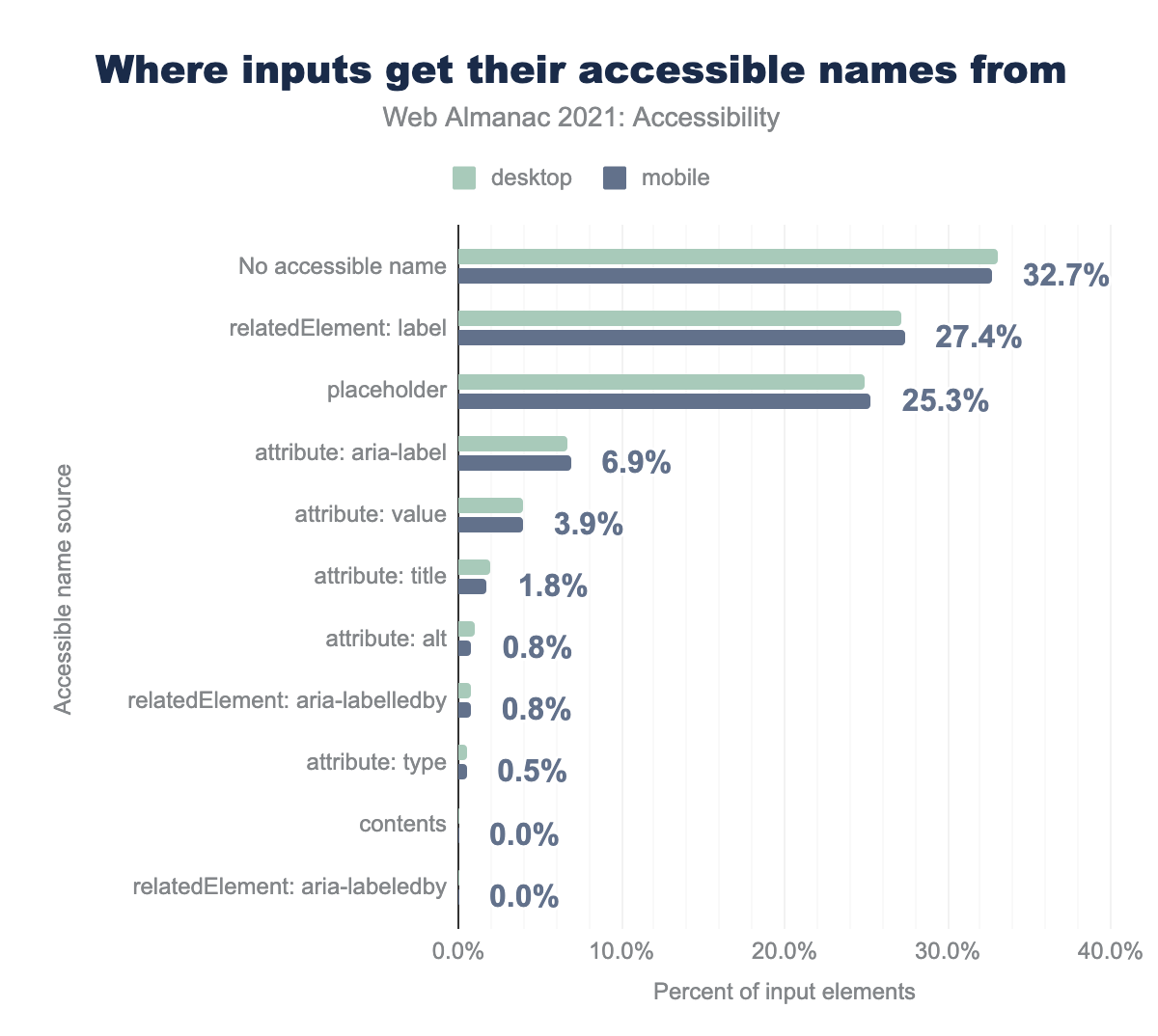
relatedElement: label is the source for 27.2% of desktop pages and 27.4% of mobile pages. For placeholder it’s 24.9% and 25.3% respectively, for attribute: aria-label it’s 6.7% and 6.9%, for attribute: value it’s 3.9% for both, for attribute: title it’s 1.9% and 1.8%, for attribute: alt it’s 1.0% and 0.8%, for relatedElement: aria-labelledby it’s 0.7% and 0.8%, for attribute: type it’s 0.6% and 0.5%, for contents and relatedElement: aria-labeledby they are too small and so show as 0.0%.The <label> element was introduced with HTML 4 in 1999. Despite being available in all modern browsers for the past 20+ years, only 27% of all <input> elements get their accessible name from a programmatically associated label and 32% of input elements have no accessible name at all.
Most importantly, without proper accessible names, screen readers and voice to text users may not be able to target or identify the purpose of a form field. <label> elements associated with an input are the most robust and expected way to do this.
This is not only important when the end user is filling in the form for the first time—it is equally important if form validation finds an error with a specific field that the user must correct before they can submit the form. For example, if a user forgot to provide the expiration date for their credit card, they cannot complete their purchase. And they cannot complete their purchase if they cannot find the errant field with the missing value and understand both the purpose of the input and the steps needed to fix the error.
The improper use of the placeholder attribute for labeling inputs
The placeholder attribute was introduced in HTML5 in 2014. Its intended use is to provide an example of the data that is expected to be provided by the user. For example, <input type="text" id="credit-card" placeholder="1234-5678-9999-0000"> will display the placeholder as faint text in the input field that will disappear the moment the user begins typing in the field.
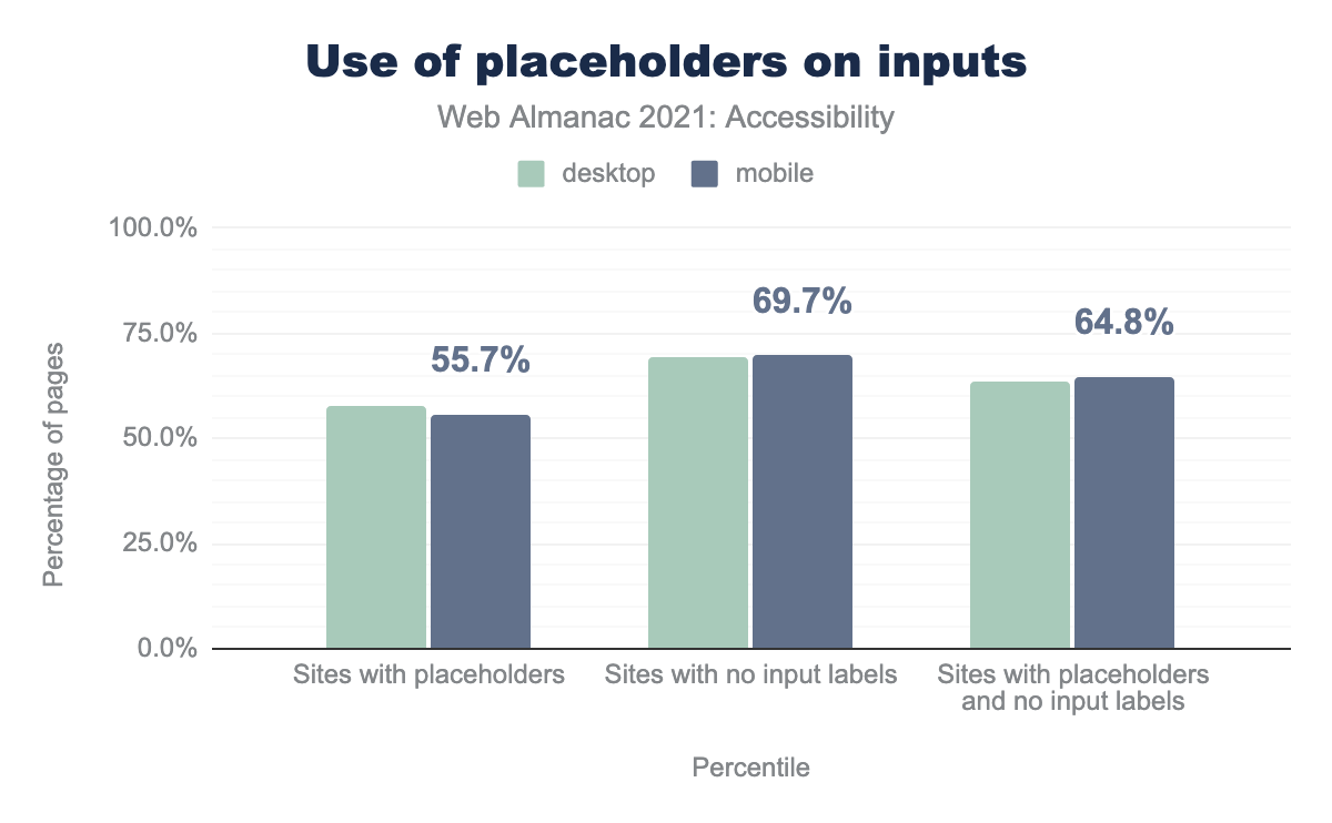
The improper use of a placeholder as a replacement for the <label> element is surprisingly prevalent. Roughly 58% of desktop and mobile websites in this year’s survey used the placeholder attribute. Of those sites, nearly 65% of them included the placeholder attribute and failed to include a programmatically associated <label> element.
There are many accessibility issues that placeholder text can present. For example, because it disappears when the user begins to type, people with cognitive disabilities can be disoriented and lose context for the purpose of the form element.
The HTML5 specification clearly states, “The placeholder attribute should not be used as an alternative to a label.”
The W3C’s Placeholder Research lists 26 different articles that advise against the flawed design approach of using a placeholder instead of the semantically correct <label> element. It goes on to say:
Use of the placeholder attribute as a replacement for a label can reduce the accessibility and usability of the control for a range of users including older users and users with cognitive, mobility, fine motor skill or vision impairments.
Requiring information
When web developers gather input from their end users, they need a clear way to indicate what information is optional, and what information is required to proceed. For example, a shipping address is optional if the end user is buying something online that they can download. However, the method of payment is most likely required in order to complete the sale.
Before HTML5 introduced the required attribute for <input> fields in 2014, web developers were forced to solve this problem on an ad hoc, case-by-case basis. A common convention is to put an asterisk (*) in the label for required input fields. This is purely a visual, stylistic convention—labels with asterisks don’t enforce any kind of field validation. Additionally, screen readers typically announce this character as “star” unless it is explicitly hidden from assistive technology, which can be confusing.
There are two attributes that can be used to communicate the required state of a form field to assistive technology. The required attribute will be announced by most screen readers and actually prevents form submission when a required field has not been properly filled out. The aria-required attribute can be used to indicate required fields to assistive technology, but does not come with any associated behavior that would interfere with form submission.
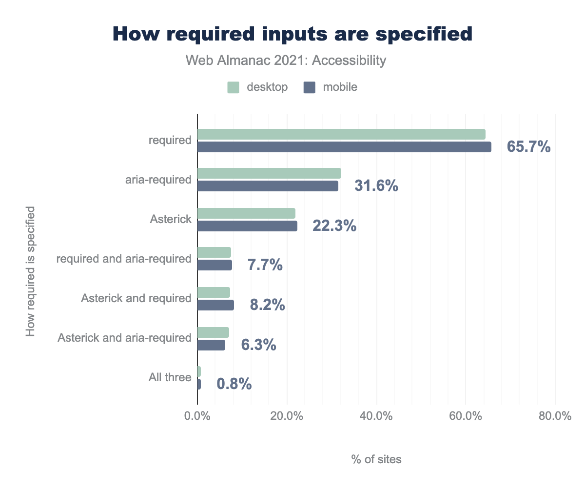
required attribute is used on 64.3% of desktop sites and 65.7% of mobile sites, aria-required is used by 32.3% and 31.6%, asterisk is used by 21.9% and 22.3%, required and aria-required is used by 7.4% and 7.7%, asterisk and aria-required is used by 7.3% and 8.2%, asterisk and required us used by 7.1% and 6.3%, and all three are used by 0.8% of sites on both.We found that 21% of desktop websites had form elements that have either an asterisk (*) in their label, the required attribute or the aria-required attribute or some combination of these techniques. Two-thirds of these form elements used the required attribute. About a third of all required inputs used the aria-required attribute. Roughly 22% had an asterisk in their label.
Media on the web
Accessibility plays an increasingly important role in all media consumption on the web. For people who are deaf or hard of hearing, captions provide access to video. For people who are blind or have vision impairments, audio descriptions can describe a scene. Without removing the barriers to access to media content, we are excluding people from the majority of what gets visited on the web.
According to this Streaming Media study, “by 2022, video viewing will account for 82% of all internet traffic”. Whenever you use media in your web content—images, audio, or video—you must ensure it is accessible to all.
Overview of text alternatives
Every HTML media element allows you to provide text alternatives, but not every author takes advantage of this accessibility capability.
The <img> element for displaying pictures was introduced in the HTML 2.0 specification in 1995. The alt attribute—introduced at the same time—provides a clear mechanism for the web developer to provide a text alternative for the image.
This alternative description of the image is used by screen readers to describe the image for someone who can’t see the image. It is also used to describe the image to everyone if the image cannot be downloaded or displayed. One type of “user” who can’t see the image is a search engine—good alt text plays an important role in Search Engine Optimization (SEO), so that web pages that show the image can be discovered by text searches.
The HTML5 specification introduced the <video> and <audio> elements in 2014 to provide a standards-based way to incorporate rich media in your website that didn’t require a third-party browser plugin. Both the <video> and <audio> elements allow a <track> element to be included, so that closed captions, subtitles, and audio descriptions can provide alternate, text-based ways to enjoy the rich media.
These tracks provide the same SEO benefits as alt text does for images, although in 2021, less than 1% of the websites surveyed provided <track> elements.
Images
The alt attribute allows web authors to provide a text alternative for the visual information communicated in an image. A screen reader can convey its visual meaning through audio by announcing the image’s alternative text. Additionally, if images are unable to load, the alternative text for a description will be displayed.
Images need to be described appropriately, in some cases short descriptions are helpful, and in other cases a longer description is needed to capture the meaning or intent of the image.
The 2021 Lighthouse audit data shows that 57% of sites pass the test for images with alt text, a small increase from 54% the year before. This test looks for the presence of at least one of the alt, aria-label or aria-labelledby attributes on img elements. In most cases using the alt attribute is the best choice.
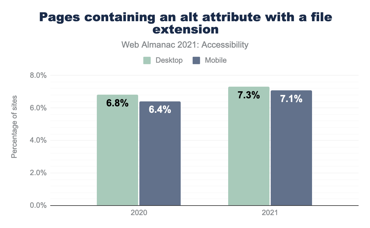
alt attribute. This increased to 7.3% of desktop sites and 7.1% of mobile sites in 2021.alt attribute with a file extension.
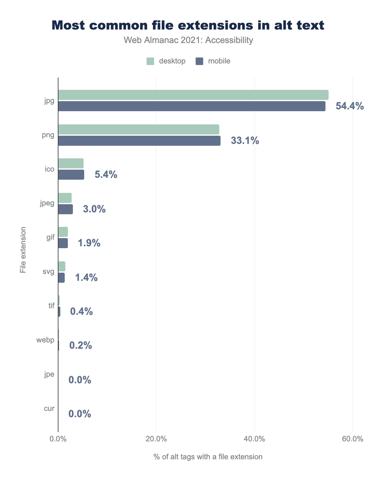
Automated checks for the presence of alternative text usually do not assess the quality of this text. One unhelpful pattern is describing the image with the file extension name. We found that 7.1% of desktop sites (with at least one instance of the alt attribute) had a file extension in the value of at least one img element’s alt attribute, compared to 7.3% the previous year.
jpg is used 55.1% of the time on desktop sites and 54.44% for mobile, png is 32.8% and 33.11% and respectively, ico is 5.2% and 5.36%, jpeg is 2.8% and 3.00%, gif is 2.0% and 1.92%, svg is 1.5% and 1.36%, tif is 0.3% and 0.38%, webp is 0.2% and 0.21%, jpe is 0.0% and 0.05%, and finally cur is 0.0% and 0.03%.alt text.
The top 5 file extensions explicitly included in the alt text value (for sites with images that have non-empty alt values) are jpg, png, ico, gif, and jpeg. This likely comes from a CMS or another auto-generated alternative text mechanism. It is imperative that these alt attribute values be meaningful, regardless of how they are implemented.
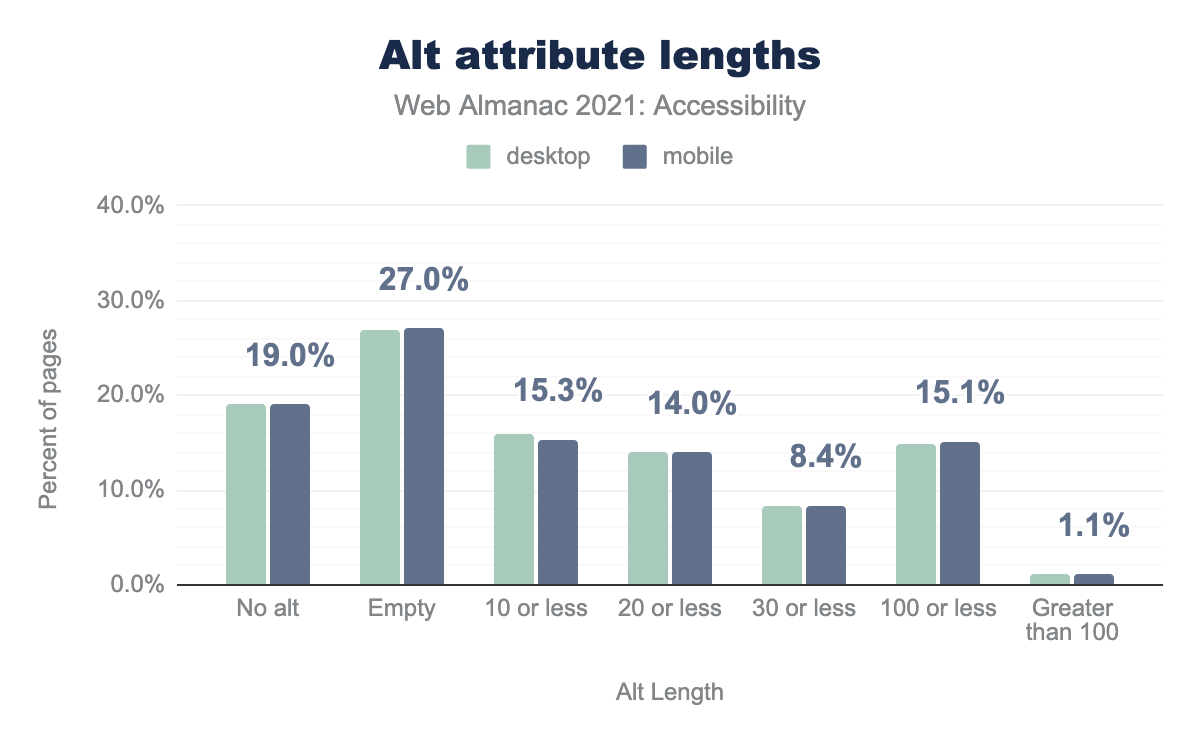
alt is set on 19.1% of desktop images and 19.0% of mobile images, it is set to empty on 26.9% and 27.0% respectively, it is 10 characters or less on 15.9% and 15.3%, 20 characters or less on 13.9% and 14.0%, 30 characters or less on 8.2% and 8.4%,100 characters or less on 14.8% and 15.1%, and it is greater than 100 characters on 1.1% and 1.1%.alt attribute lengths.
We found that 27% of alt text attributes were empty. In an ideal world this would indicate that the associated images are decorative, and should not be described by assistive technologies. However, the majority of images add value to an interface and as such, should be described. We found that 15% have 10 or fewer characters, which would be a strangely short description for most images, indicating that information parity has not been achieved.
Audio
<track> provides a way for a text equivalent to be provided for audio in <audio> and <video> elements. This allows people with permanent or temporary hearing loss to be able to understand audio content.
<audio> element have at least one accompanying <track> element.
<track> loads one or more WebVTT files, which allows text content to be synchronized with the audio it is describing. We found 0.02% of all pages on desktop and 0.05% of all pages on mobile with a detectable <audio> element had at least one accompanying <track> element.
These data points do not include audio embedded via an <iframe> element, which is common for content like podcasts that use a third-party service to host and list recordings.
Video
The <video> element was only present on roughly 5% of the websites included in the 2021 Web Almanac.
<video> element have at least one accompanying <track> element.
Similar to the results of the <audio> survey, the <track> element was included with a corresponding <video> element less than 1% of the time—0.5% for desktop sites, and 0.6% for mobile sites. In actual numbers, only 2,836 desktop sites out of 6.3 million included a <track> element where a <video> element was present. Only 2,502 mobile sites out of 7.5 million made their videos accessible by including a corresponding <track> element with content loaded via the <video> element.
Much like the <audio> element, this figure may not account for video content loaded by a third party <iframe>, such as an embedded YouTube video. It should also be noted that most popular third-party audio and video embedding services include the ability to add synchronized text equivalents.
Supporting assistive technology with ARIA
Accessible Rich Internet Applications—or ARIA—is a suite of web standards that was first published by the Web Accessibility Initiative in 2014. ARIA provides a set of attributes we can add to HTML markup to enhance the experience for users of assistive technology.
There are many nuances and complexities to the use of ARIA, as well as varying degrees of assistive technology support. As a general rule, it should be used sparingly, and never in instances when there is an equivalent native HTML solution that could be leveraged. While ARIA can provide helpful information to assistive technology, it comes with no associated behavior such as keyboard operability.
The 5 rules of ARIA describe some helpful guiding principles for ARIA usage. In September of 2021, a W3 working group published ARIA in HTML, a proposed specification with very detailed information about how and when ARIA can be used.
ARIA roles
When assistive technology encounters an element, the element’s role communicates information about how someone might interact with its content. For example, an <a> element will expose a link role to assistive technology, which typically conveys that the element will navigate somewhere when activated.
HTML5 introduced many new native elements, all which have implicit semantics, including roles. For example, the <nav> element has an implicit role="navigation" and does not need to have this role added explicitly via ARIA in order to convey its purpose information to assistive technology.
ARIA can be used to explicitly add roles to content that does not have a fitting native HTML role. For example, when creating a tablist widget, a tablist role can be assigned to the container element since there is no native HTML equivalent.
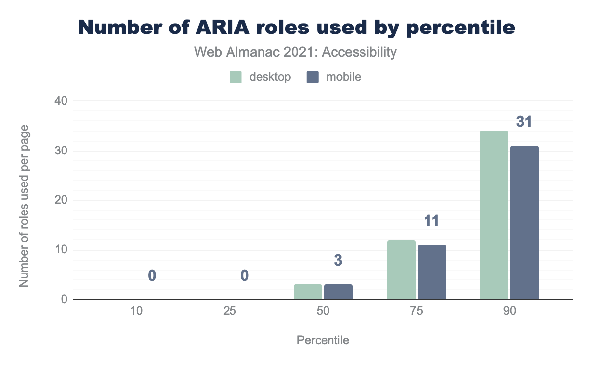
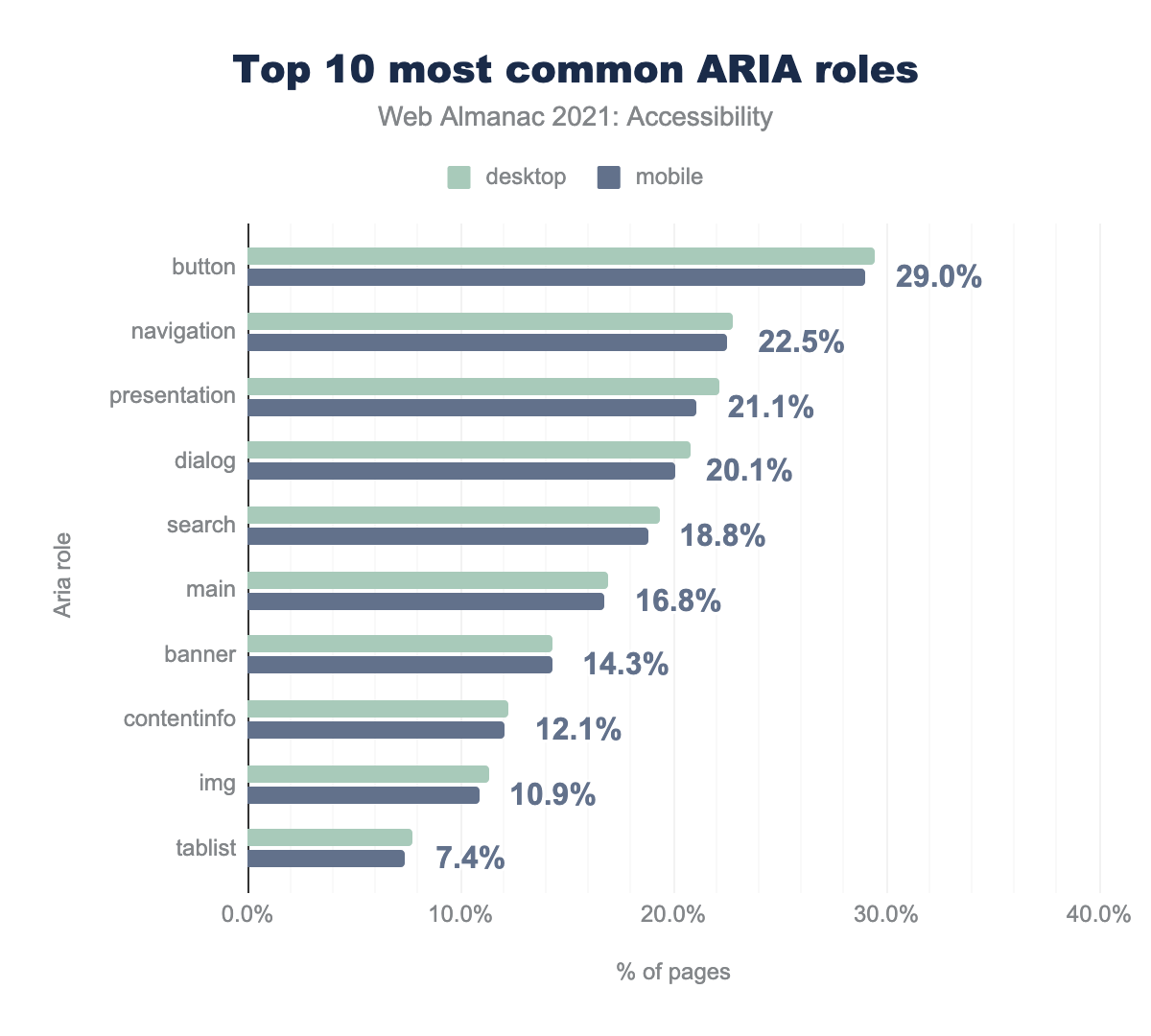
Currently 69% (up from 65% in 2020) of desktop pages have at least one instance of an ARIA role attribute. The median site has 3 instances (up from 2 in 2020) of the role attribute. The most commonly used roles are listed below.
button is used by 29.4% of desktop sites and 29.0% of mobile sites, navigation by 22.8% and 22.5% respectively, presentation by 22.2% and 21.1%, dialog by 20.8% and 20.1%, search by 19.3% and 18.8%, main by 16.9% and 16.8%, banner by 14.3% and 14.3%, contentinfo by 12.2% and 12.1%, img by 11.4% and 10.9%, and finally tablist by 7.7% and 7.4%.Just use a button!
One of the most common misuses of ARIA roles is adding a button role to non-interactive elements such as <div>s and <span>s, or to <a> elements. A native HTML <button> element comes with an implicit button role and the expected keyboard operability and behavior and should be the first approach before reaching for ARIA.
We found that 29% (up from 25% in 2020) of desktop sites and 29% of mobile sites (up from 25% in 2020) had home pages with at least one element with an explicitly assigned role="button". This suggests that close to a third of websites are using the button role on elements in order to change their semantics, with the exception of buttons that have been explicitly assigned the button role, which is redundant.
If non-interactive elements such as <div>s and <span>s have been assigned a button role, there is a significant chance that the expected keyboard focus order and operability will not be applied, which would result in WCAG 2.1.1 Keyboard and 2.4.3 Focus order problems. In addition, Windows High Contrast Mode will not honor ARIA, so elements that are not native HTML button elements may not appear to be interactable in this mode. We found that 11% of desktop and mobile sites have either a <div> or a <span> with an explicit button role.
When a button role is applied to an <a> element, it overrides the implicit link role that anchor elements come with. This can lead to a confusing user experience because the expected behavior for a button would be to trigger an in-page action, whereas a link would typically navigate somewhere. There would also be a violation WCAG 2.1.1, Keyboard if the correct keyboard behavior has not been implemented (links are not activated with the space key, whereas buttons are). Additionally, when a button role is announced by a screen reader without the expected corresponding behavior, it can create a confusing and disorienting experience for an assistive technology user.
We found that 19% of desktop pages (up from 16% in 2020) and 18% (up from 15% in 2020) of mobile pages contained at least one anchor element with role="button". A native <button> element would be a better choice, per the first rule of ARIA.
This act of adding ARIA roles, or a “role-up”, is usually less ideal than using the correct native HTML element. Again, in the vast majority of these cases a better pattern than explicitly defining role="button" on the element in question would be to leverage the native HTML <button> element, as it comes with the expected semantics and behavior.
Using presentation role
When an element has role="presentation" declared on it, its semantics are stripped away, as well as any of its child elements. For example, declaring role="presentation" on a parent table or list element will cascade the role to any child elements. This will also strip the semantics.
Removing an element’s semantics means that it is no longer that element in terms of its behavior or how it is understood by assistive technology, leaving only its visual appearance. For example, a list with a role="presentation" will no longer communicate any information to a screen reader about the list structure. We found that 22% of desktop pages and 21% of mobile pages have at least one element with role="presentation". There are very few use cases where this is particularly helpful for assistive technology users, so use this role sparingly and thoughtfully.
Labelling and describing elements with ARIA
Parallel to the DOM there is a similar browser structure called the accessibility tree. It contains information about HTML elements including accessible names, descriptions, roles and states. This information is conveyed to assistive technology through accessibility APIs.
The accessibility tree has a computation system that assigns the accessible name (if there is one) to a control, widget, group, or landmark such that it can be announced or targeted by assistive technology.
The accessible name can be derived from an element’s content (such as button text), an attribute (such as an image alt text value), or an associated element (such as a programmatically associated label for a form control). There is a specificity ranking that happens to determine which value is assigned to the accessible name if there are multiple potential sources.
For more information about accessible names visit Léonie Watson’s article, What is an accessible name?
We can also use ARIA to provide accessible names for elements. There are two ARIA attributes that accomplish this, aria-label and aria-labelledby. Either of these attributes will “win” the accessible name computation and override the natively derived accessible name. It is important to use these two attributes with caution and be sure to test with a screen reader or look at the accessibility tree to confirm that the accessible name is what your users will expect. When using ARIA to name an element, it is important to ensure that the WCAG 2.5.3, Label in Name criterion has not been violated, which expects visible labels to be at least a part of its accessible name.
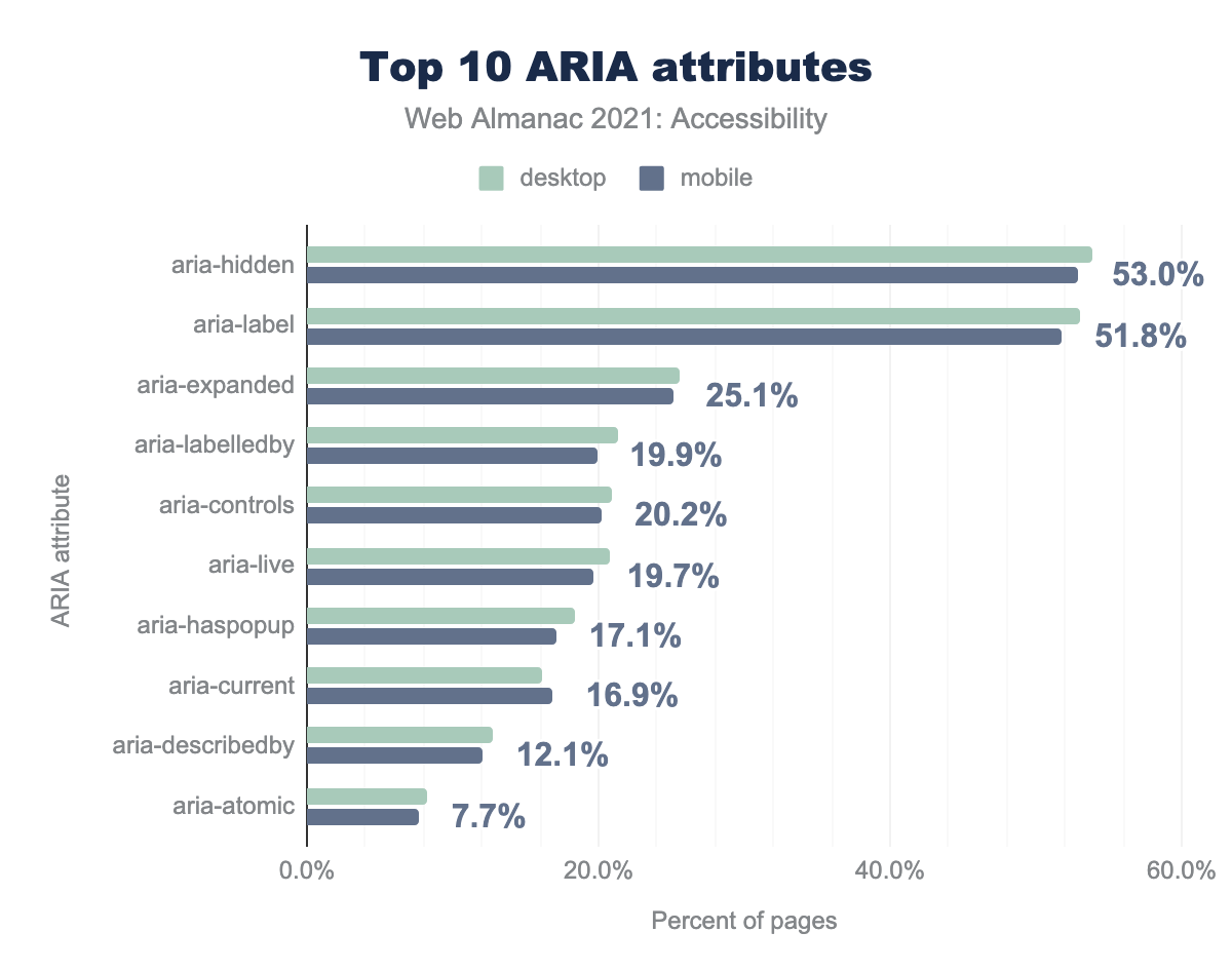
aria-hidden is used by 53.8 of desktop sites and 53.0% of mobile sites, aria-label by 53.1 and 51.8% respectively, aria-expanded by 25.5 and 25.1%, aria-labelledby by 21.3 and 19.9%, aria-controls by 20.9 and 20.2%, aria-live by 20.8 and 19.7%, aria-haspopup by 18.3 and 17.1%, aria-current by 16.1 and 16.9%, aria-describedby by 12.7 and 12.1%, and finally aria-atomic by 8.2 and 7.7%.The aria-label attribute allows a developer to provide a string value, and this will be used for the accessible name for the element. It is worth noting that voice to text users may have difficulty targeting controls that are named without visible text as a reference. People with cognitive disabilities often benefit from visible text as well. An invisible accessible name is better than no accessible name, however, in most cases, a visible label should either supply the accessible name or at a minimum be contained within an element’s accessible name.
We found that 53% of desktop pages (up from 40% in 2020) and 52% of mobile home pages (up from 39% in 2020) had at least one element with the aria-label attribute, making it the most popular ARIA attribute for providing accessible names, with a very large increase in usage in 1 year. This could be a positive indication that more elements that previously were lacking an accessible name now have one. However, it could also signify an increase in elements having no visible label, which could negatively impact people with cognitive disabilities and voice to text users.
The aria-labelledby attribute accepts an id reference as its value, which associates it with another element in the interface to provide its accessible name. The element becomes “labelled by” this other element which supplies its accessible name. We found that 21% of desktop pages (up from 18% in 2020) and 20% of mobile pages (up from 16% in 2020) had at least one element with the aria-labelledby attribute.
The aria-describedby attribute can be used in cases where a more robust description is needed for an element. It also accepts an id reference as its value to connect with descriptive text that exists elsewhere in the interface. It does not supply the accessible name; it should be used in conjunction with an accessible name as a supplement, not a replacement. We found that 13% of desktop pages and 12% of mobile pages had at least one element with the aria-describedby attribute.
Where do buttons get their accessible names from?
Buttons typically get their accessible names from their content or an ARIA attribute. Per the first rule of ARIA, if an element can derive its accessible name without the use of ARIA, this is preferable. Therefore a <button> should get its accessible name from its text content rather than an ARIA attribute if possible.
There is a common implementation where text content is not used to supply the accessible name because the button is a graphical control using an image or icon. This can be problematic for voice to text users who need to target the control without visible text and should not be used if visible text is an option.
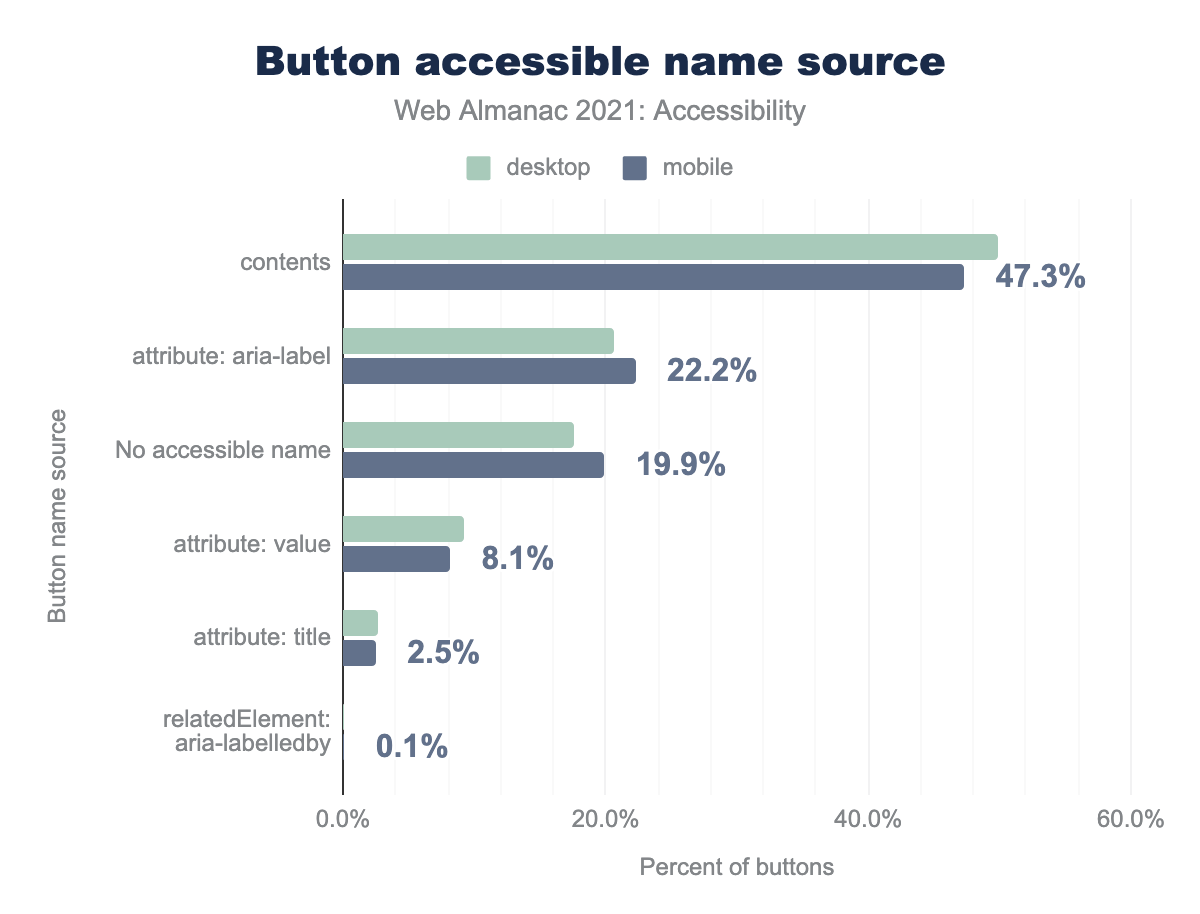
aria-label attribute is used for 20.7% and 22.2% respectively, there is no accessible name for 17.5% and 19.9%, the value attribute is used for 9.2% and 8.1%, title attribute is used for 2.6% and 2.5%, an aria-labelledby related element is used for 0.1% and 0.1%.We found that 57% of buttons on both desktop and mobile sites get their accessible name from content. We also found that 29% of buttons on desktop sites and 27% of buttons on mobile sites get their accessible names from the aria-label attribute.
Hiding content
There are several ways to ensure that assistive technology will not discover content. We can leverage CSS display: none; to omit the elements from the accessibility tree. If an author wishes to hide content from screen readers specifically, they can use aria-hidden="true". Note that unlike display: none; a declaration of aria-hidden="true" will not visibly remove an element and its children.
aria-hidden attribute.
We found that 54% of desktop pages (up from 48% in 2020) and 53% of mobile pages (up from 49% in 2020) had at least one instance of an element with the aria-hidden attribute.
These techniques are most helpful when something in the visual interface is redundant or unhelpful to assistive technology users. Hiding content from assistive technology should never be used to skip over content that is challenging to make accessible.
Hiding and showing content is a prevalent pattern in modern interfaces, and it can be helpful to declutter hidden UI for everyone. Hide/show widgets should be making use of the aria-expanded attribute to indicate to assistive technology that something can be revealed when the control is activated and hidden when activated again. We found that 26% of desktop pages (up from 21% in 2020) and 25% of mobile pages (up from 21% in 2020) had at least one element with the aria-expanded attribute.
Screen reader-only text
A common technique that developers employ to supply additional information for screen reader users is to use CSS to visually hide a passage of text but make it discoverable by a screen reader. Since display: none; prevents content from being present in the accessibility tree, there is a common pattern involving a specific set of declarations of CSS code.
sr-only or visually-hidden class.
The most common CSS class names for this code snippet (both by convention and throughout libraries like Bootstrap) are sr-only and visually-hidden. We found that 14% of desktop pages and 13% of mobile pages had one or both of these CSS class names. It is worth noting that there are screen reader users who have some vision, therefore over-reliance on visually hidden text could be confusing for some.
Dynamically-rendered content
The presence of new or updated content in the DOM sometimes needs to be communicated to screen readers. Some thought needs to be put into which updates need to be conveyed to avoid frustration. For example, form validation errors need to be conveyed whereas a lazy-loaded image may not. Updates to the DOM also need to be done in a way that is not disruptive.
ARIA live regions allow us to listen for changes in the DOM, such that the updated content can be announced by a screen reader. We found that 21% of desktop pages (up from 17% in 2020) and 20% of mobile pages (up from 16% in 2020) have live regions. For more information about live region variants and usage check out the MDN live region documentation or play with this live demo by Deque.
Accessibility overlays
Accessibility overlays, sometimes referred to as accessibility plugins or overlay widgets, are digital products that are marketed as tools to easily solve a website’s accessibility issues. The Overlay Fact Sheet defines them as “a broad term for technologies that aim to improve the accessibility of a website. They apply third-party source code (typically JavaScript) to automate improvements to the front-end code of the website.”
Many of these products have deceptive marketing materials suggesting that one line of code can make websites accessible, or at least legally compliant from an accessibility standpoint.
For example, accessiBe, one of the most aggressive products in this space, explains their process as being able to make sites accessible and compliant within 48 hours by simply pasting their JavaScript installation code into production code.
Unfortunately, web accessibility is simply not possible to achieve with an out of the box solution like this. If it were, we would likely not see the sobering statistics throughout this chapter.
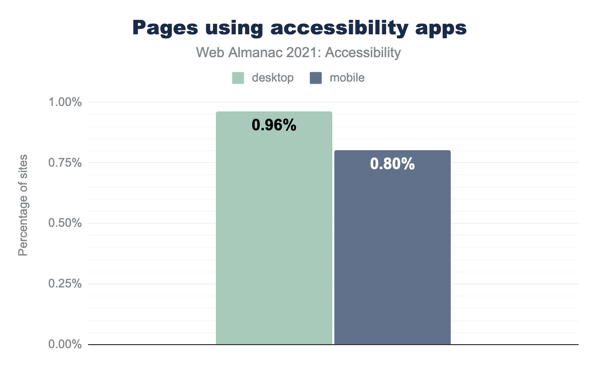
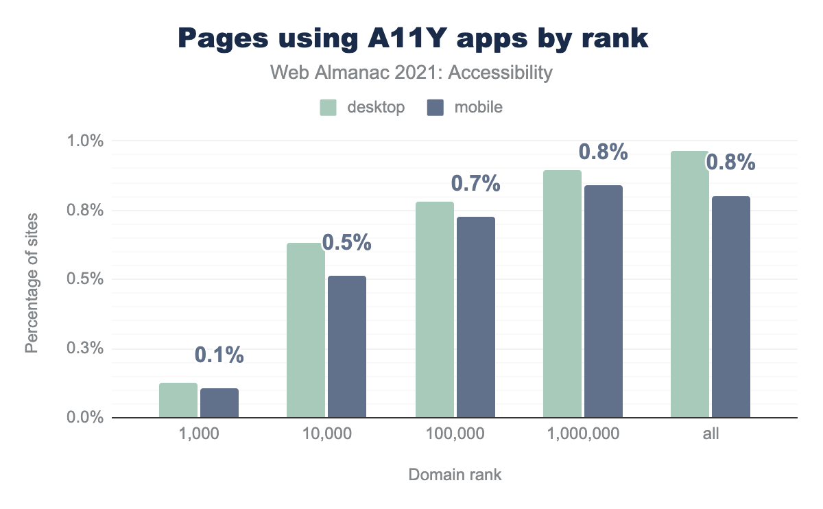
We found that 0.96% of desktop websites—or well over 60,000—use one of these accessibility overlays. It is worth noting that we have queried for a list of well-known products in this space. However, this list is not exhaustive, so this metric is likely higher in reality.
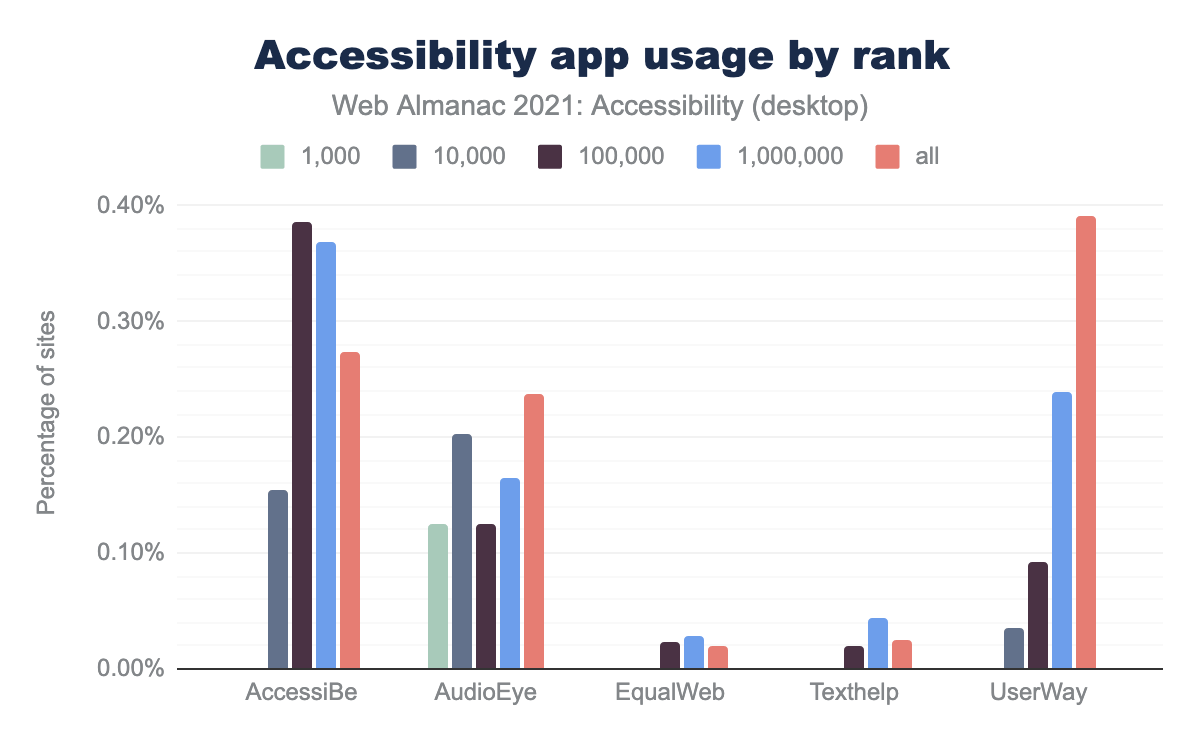
When considering domain rank, the top 1,000 websites have a lower percentage —0.1%— of overlay usage. However, considering the reach of these top-ranking sites, the potential impact of even one website with this much traffic using an overlay is very substantial.
The consequences of overlays
These tools often interfere with assistive technologies and actually make websites less accessible for many, as is explored by a Vice article aptly titled “People with Disabilities Say This AI Tool is Making the Web Worse for Them”. There is even an open-source extension called accessiByeBye that was specifically developed to block overlays so that assistive technology users are not disrupted in their use of websites use a third-party overlay product.
As civil rights lawyer Haben Girma explains in this video about accessibility overlays, “AI is a tool and right now it is extremely limited in what it can do for accessibility”. She goes on to explain how auto-generated captions of her name misinterpreted “Haben Girma” as “happen grandma” and how this type of miscommunicated information can impact deaf users.
There have been tensions between some of these overlay companies and the disabled communities they purport to serve. For example, The National Federation of the Blind banned accessiBe from their national convention and released a this statement about the harm caused by the company.
It seems that accessiBe fails to acknowledge that blind experts and regular screen reader users know what is accessible and what is not. The nation’s blind will not be placated, bullied, or bought off.
Privacy concerns
Some of these tools have techniques for detecting the use of assistive technologies. This means that personal data is potentially collected about a person’s disabilities without their consent.
From the Overlay Fact Sheet:
Some overlays have been found to persist users’ settings across sites which use the same overlay. This is done by setting a cookie on the user’s computer. When the user enables a setting for an overlay feature on one site, the overlay will automatically turn on that feature on other sites… the big privacy problem is that the user never opted in to be tracked and there’s also no ability to opt-out. Due to this lack of an opt-out (other than explicitly turning off that setting) this creates General Data Protection Regulation (GDPR) and California Consumer Privacy Act (CCPA) risk for the overlay customer.
This article by Léonie Watson explores the privacy concerns of this type of data tracking in accessibility overlays.
Overlays and lawsuits
These widgets have been named as part of many accessibility lawsuits against companies who use them. According to the UsableNet’s 2020 report on Digital Accessibility Lawsuits, “Over 250 companies sued had invested in accessibility widgets or overlays”. Accessibility expert Sherri Byrne-Haber cites, “Ten percent of accessibility lawsuits filed at the end of 2020 were against companies who have installed plugins, overlays, or widgets, thinking they would make them bulletproof to ADA litigation”. It’s worth noting that accessibility laws are not limited to the Americans with Disabilities Act, there are countries all over the world with laws pointing to the WCAG.
For more information about the legal implications of using these overlays, refer to Lainey Feingold’s article Honor the ADA: Avoid Web Accessibility Quick-Fix Overlays and Adrian Roselli’s article #accessiBe Will Get You Sued.
Why do some companies use overlays?
Fundamentally, and fueled by ableism, overlays position themselves as solving a problem that most organizations struggle with. The data is clear throughout this chapter—the internet is largely inaccessible.
These products take advantage of gaps in organizational accessibility knowledge. Their framing of the problem space aims to help avoid lawsuits by automating solutions, rather than meaningfully removing barriers to access for people with disabilities. The reason these lawsuits happen is that there are real Civil Rights violations when people’s right to access online is infringed upon. For example, an AI tool supplying a poor accessible description for an image might pass the checks of an automated tool, but this does not remove the barrier for a blind person or offer information parity.
Organizations can be swayed by the deceptive marketing of some of these overlay companies promising to make their products accessible and fully compliant with one line of code and a few dollars a month. The unfortunate reality is that these tools introduce new barriers for people with disabilities and can open the organization up to unforeseen legal issues.
There is no quick fix—the onus is on organizations and digital practitioners to prioritize actually fixing the accessibility problems in their web content. A common saying amongst the disabled community is, “nothing about us without us”. Overlays have been created without much involvement from the disabled community, and some of these companies have further alienated people with disabilities who have spoken out about this. These products cannot achieve equal access to the web for people with disabilities.
Additional resources about overlays
- Connor Scott-Gardener’s experience using an overlay
- Case study of an ADA lawsuit involving an overlay
- The A11y Project - Should I Use an Accessibility Overlay?
- There’s no such thing as fully automated web accessibility
- Why Automated Tools Alone Can’t Make Your Website Accessible and Legally Compliant
- Should I Use an Accessibility Overlay?
Conclusion
As accessibility advocate Billy Gregory once said, “when UX doesn’t consider ALL users, shouldn’t it be known as SOME User Experience, or SUX”. Too often accessibility work is seen as an addition, an edge case, or even comparable to technical debt and not core to the success of a website or product as it should be.
The entire product team and organization have to prioritize accessibility as part of their accountabilities in order to succeed, all the way up to the C-suite. Accessibility work needs to shift left in the product cycle, meaning it needs to be baked into the research, ideation and design stages before it is developed. And most importantly, people with disabilities need to be included in this process.
The tech industry needs to move towards inclusion-driven development. Although this requires some up-front investment, it is much easier and likely less expensive over time to build accessibility into the entire cycle such that it can be baked into the product rather than trying to retrofit sites and apps that were constructed without it in mind.
As an industry it is time that we acknowledge the story told by the numbers in this chapter; we are failing people with disabilities. The numbers from 2021 have not moved substantially from 2020. We need to do better, and this has to come from a combination of top-down leadership and investment (including the ongoing participation from browsers) and bottom-up effort to push our practices forward and advocate for the needs, safety and inclusion of people with disabilities using the web.
